


![Amazon+Smile+Winter+2019+v2[6].jpg](https://images.squarespace-cdn.com/content/v1/56faa27cb6aa602e42a8cb8b/1569612188161-GYF0ZNNYSXSGSCMHCTUO/Amazon%2BSmile%2BWinter%2B2019%2Bv2%5B6%5D.jpg)


![1111111[1].jpg](https://images.squarespace-cdn.com/content/v1/56faa27cb6aa602e42a8cb8b/1459271404714-VTFR1CHEY4IWEAKZB5Q8/1111111%5B1%5D.jpg)


5
Say It - Website Desigh & UX, UI

4
JBP

20
Swindon College Re-brand & Design Process

39
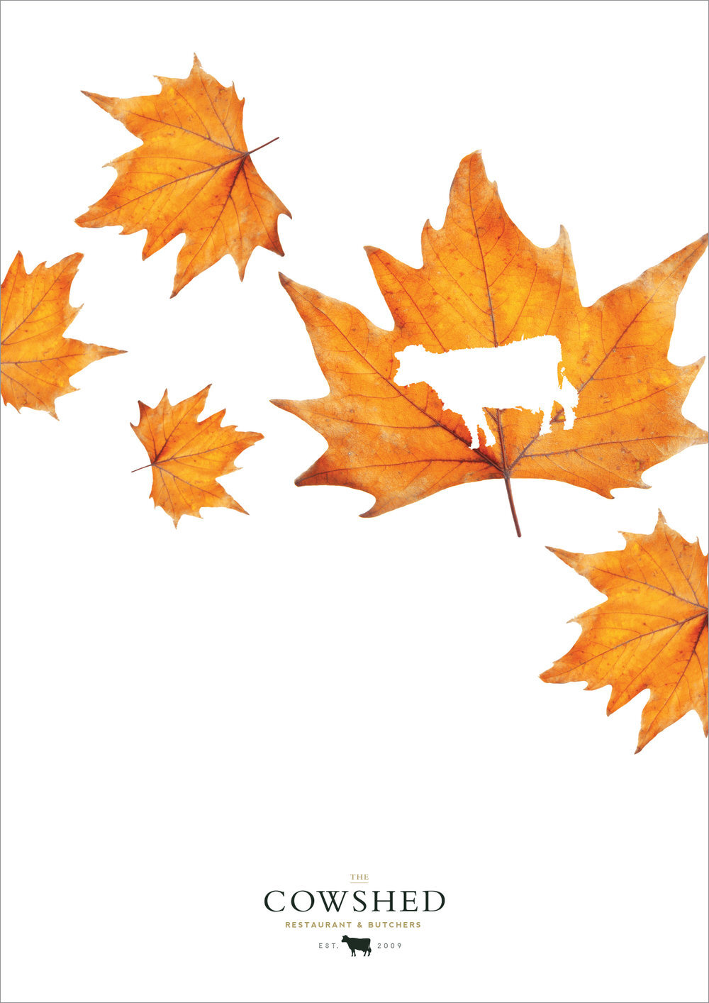
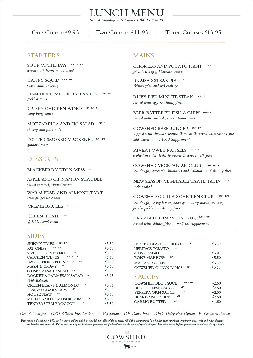
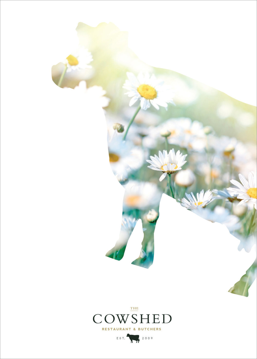
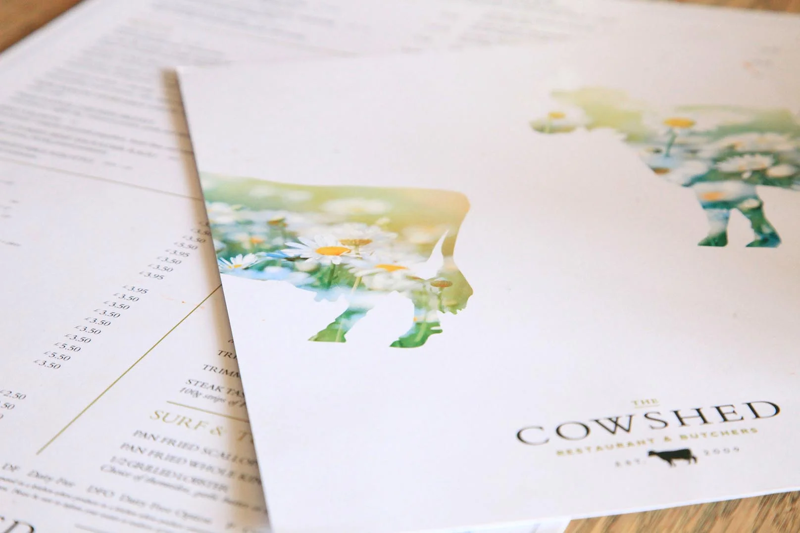
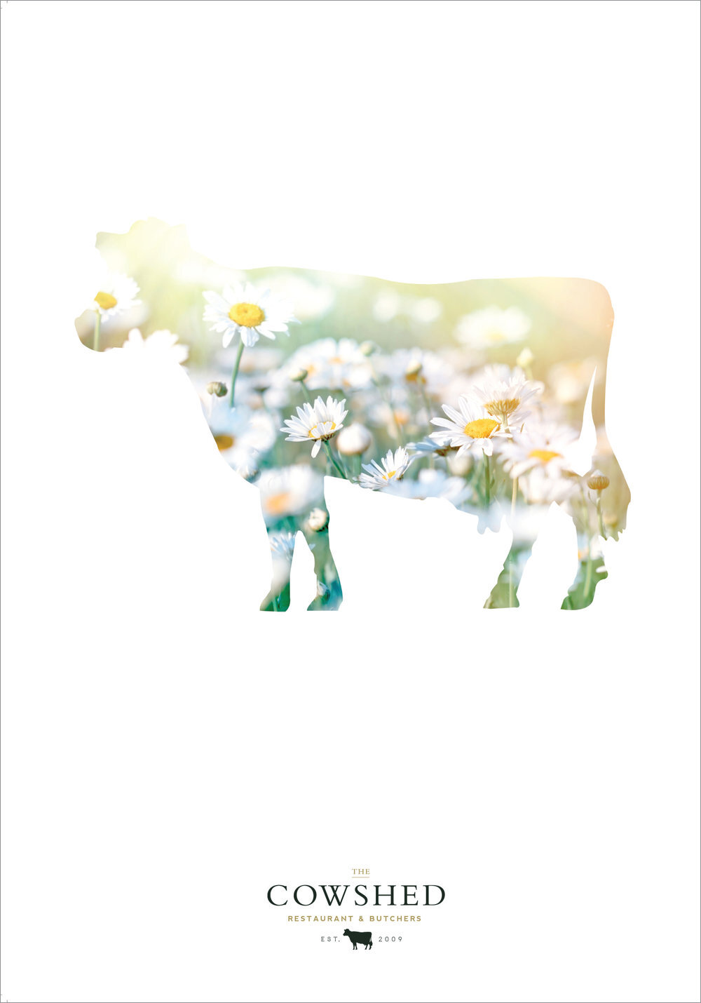
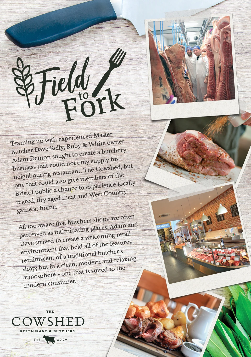
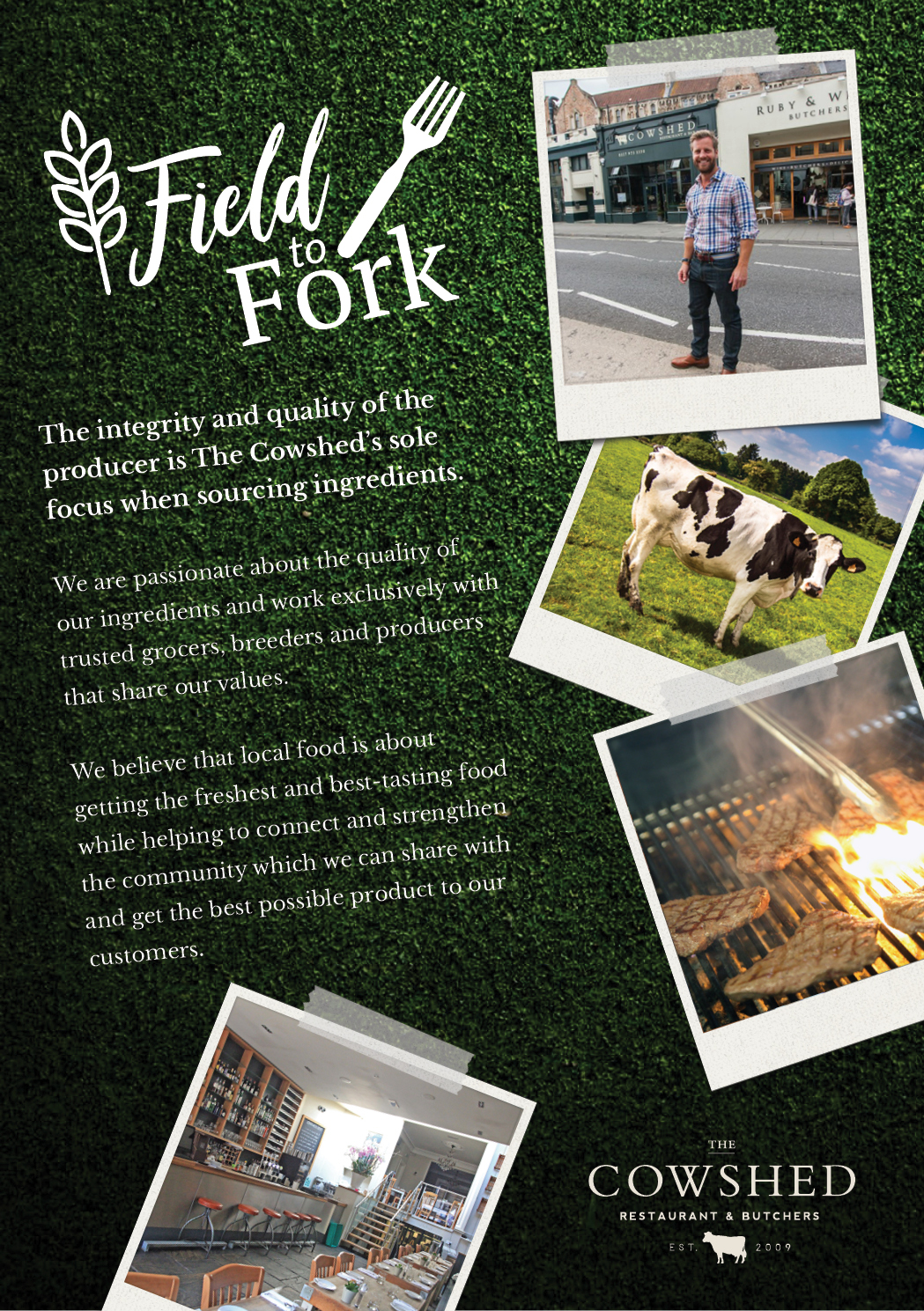
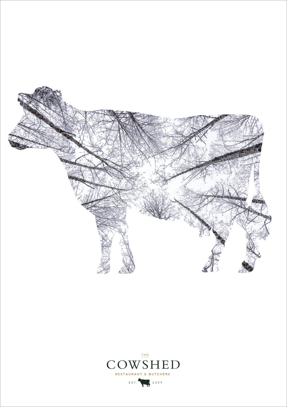
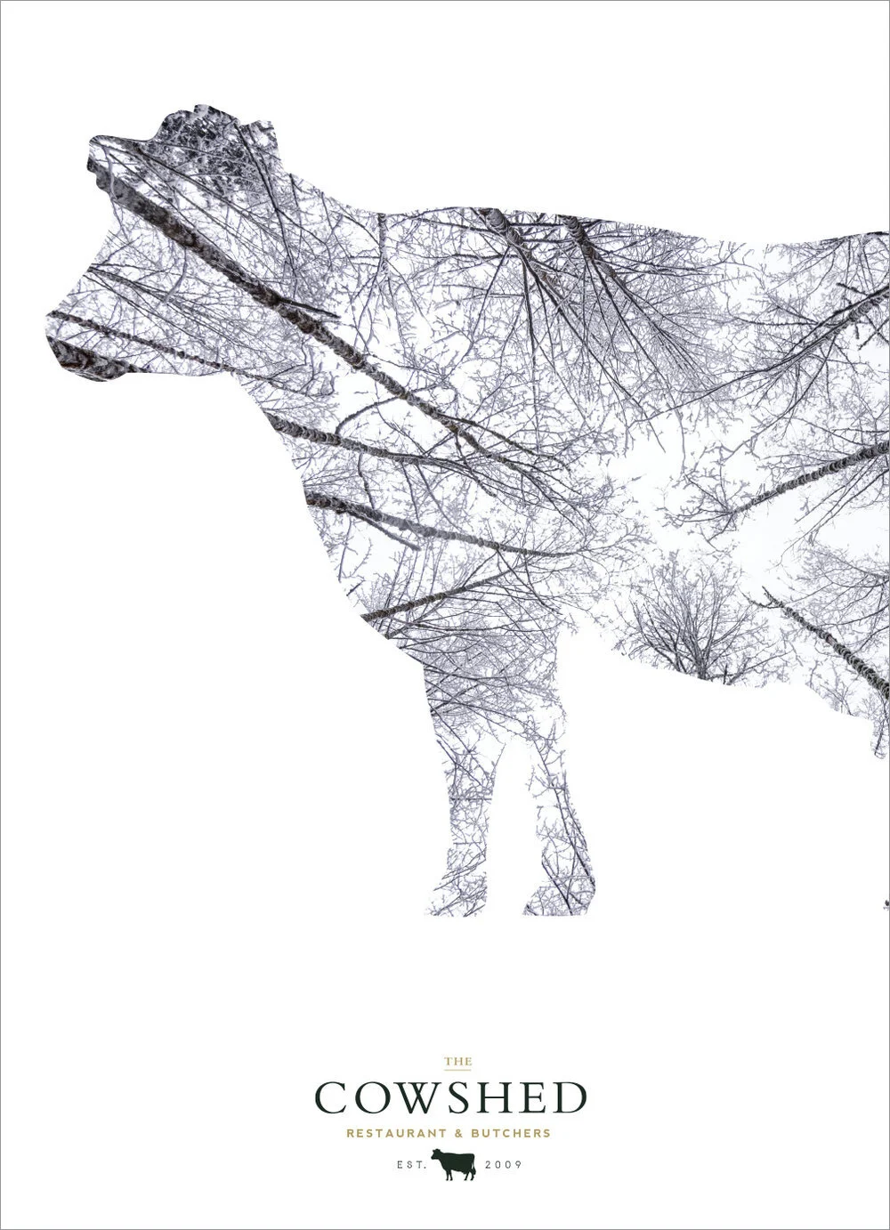
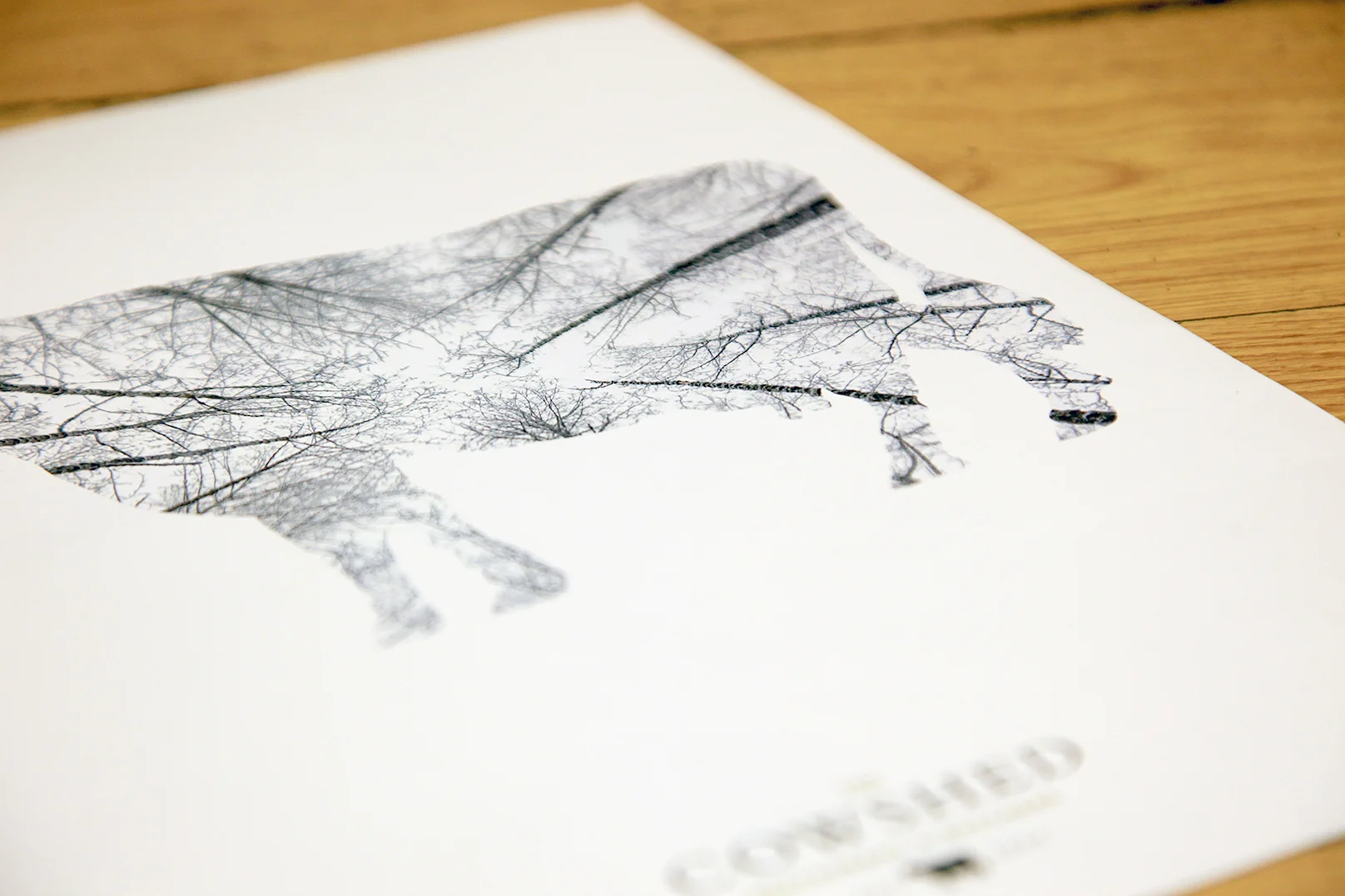
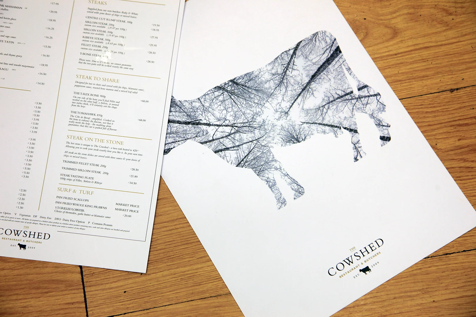
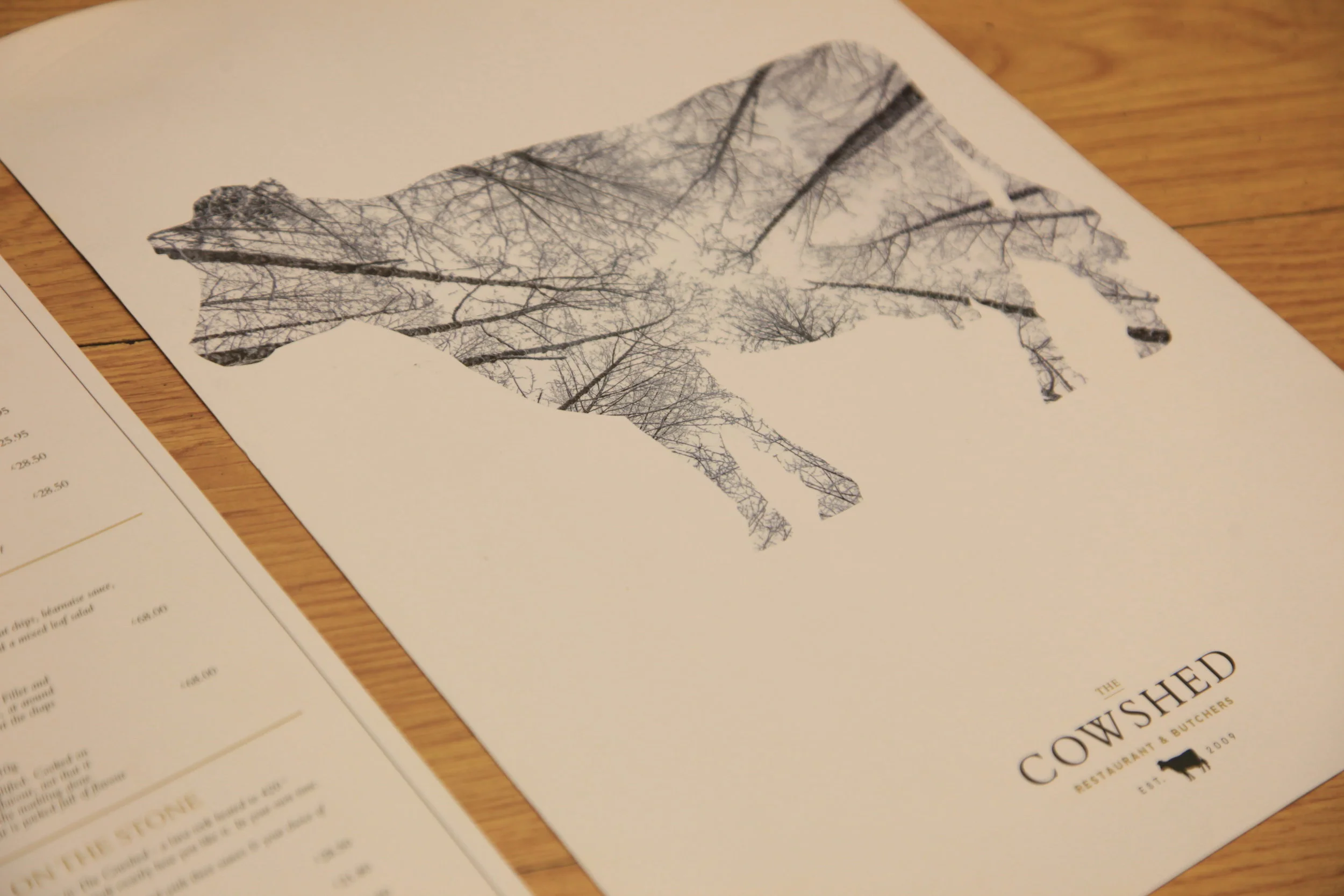
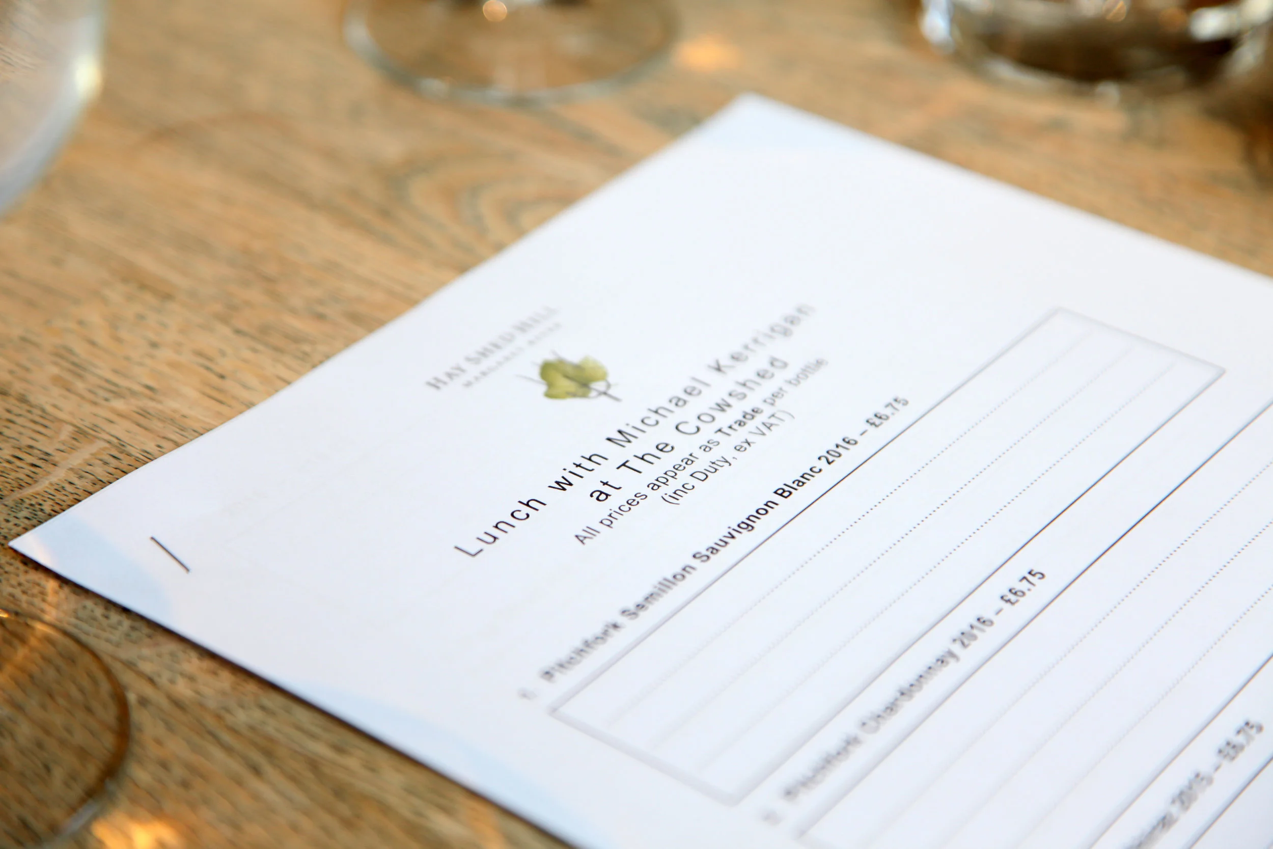
The Cowshed Bristol - Marketing, POS, Email Campiagns & Photography
9
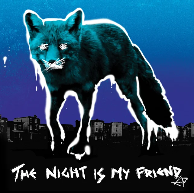
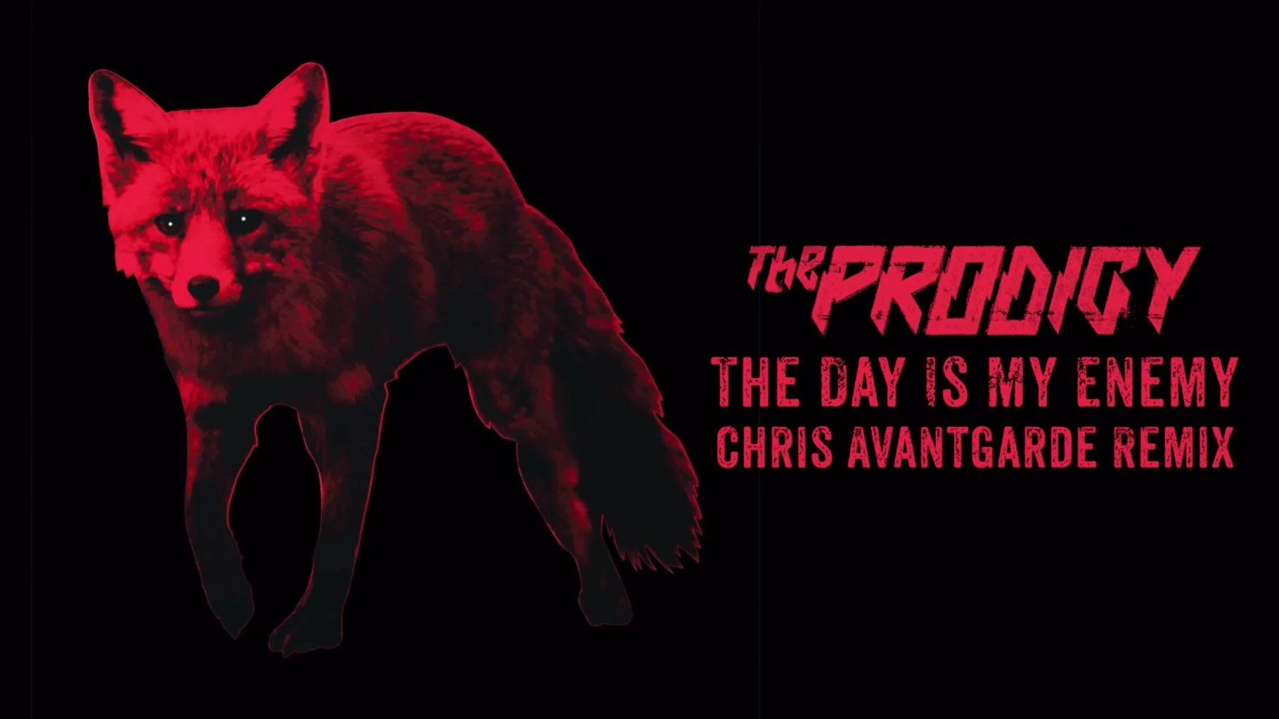
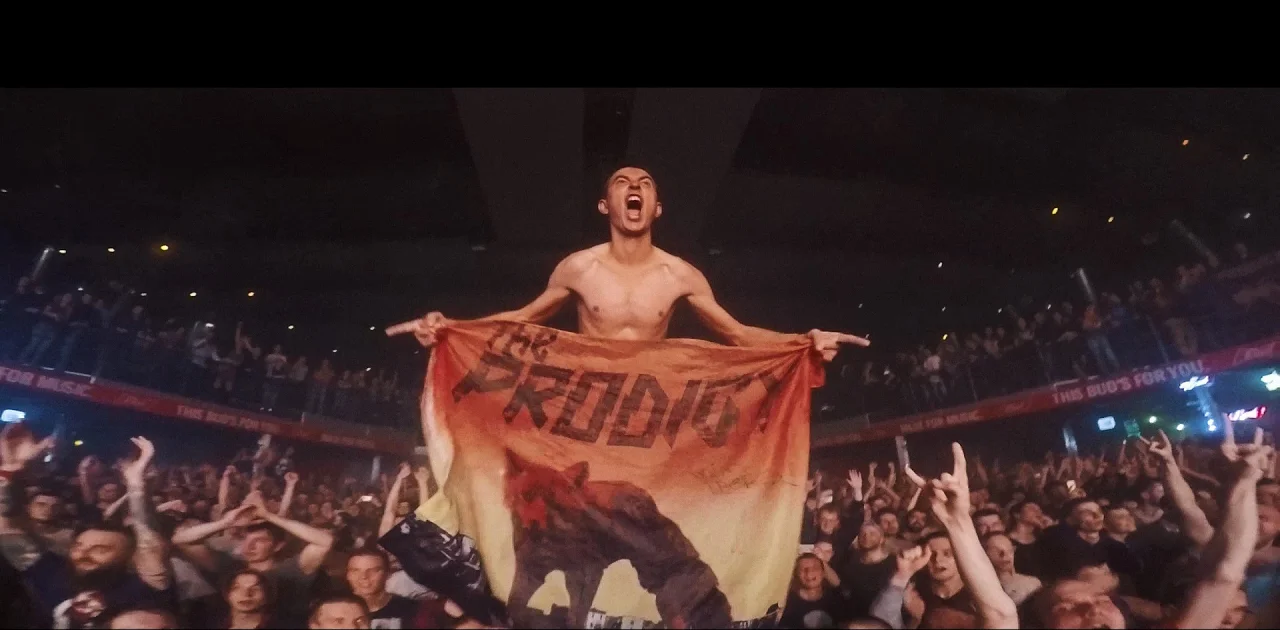
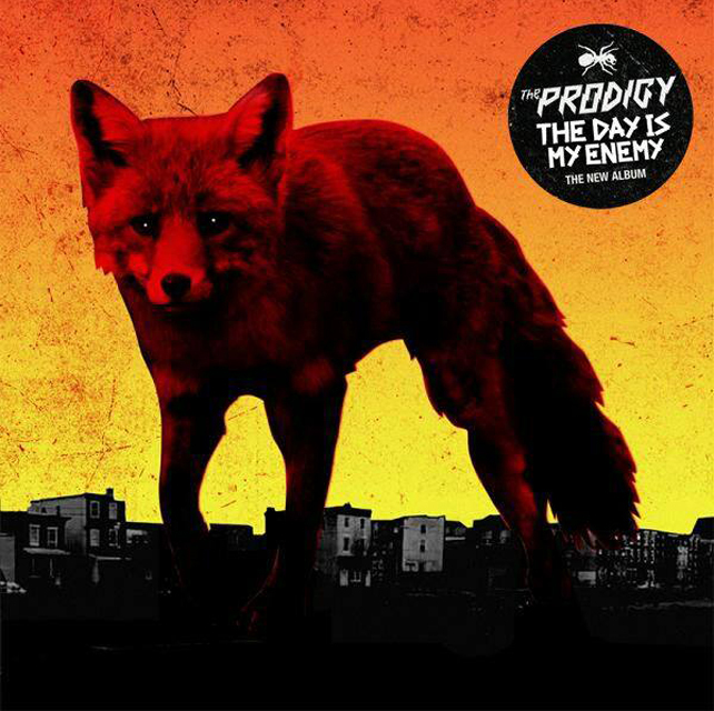
Photography for the album cover and EP for the music group The Prodigy

7
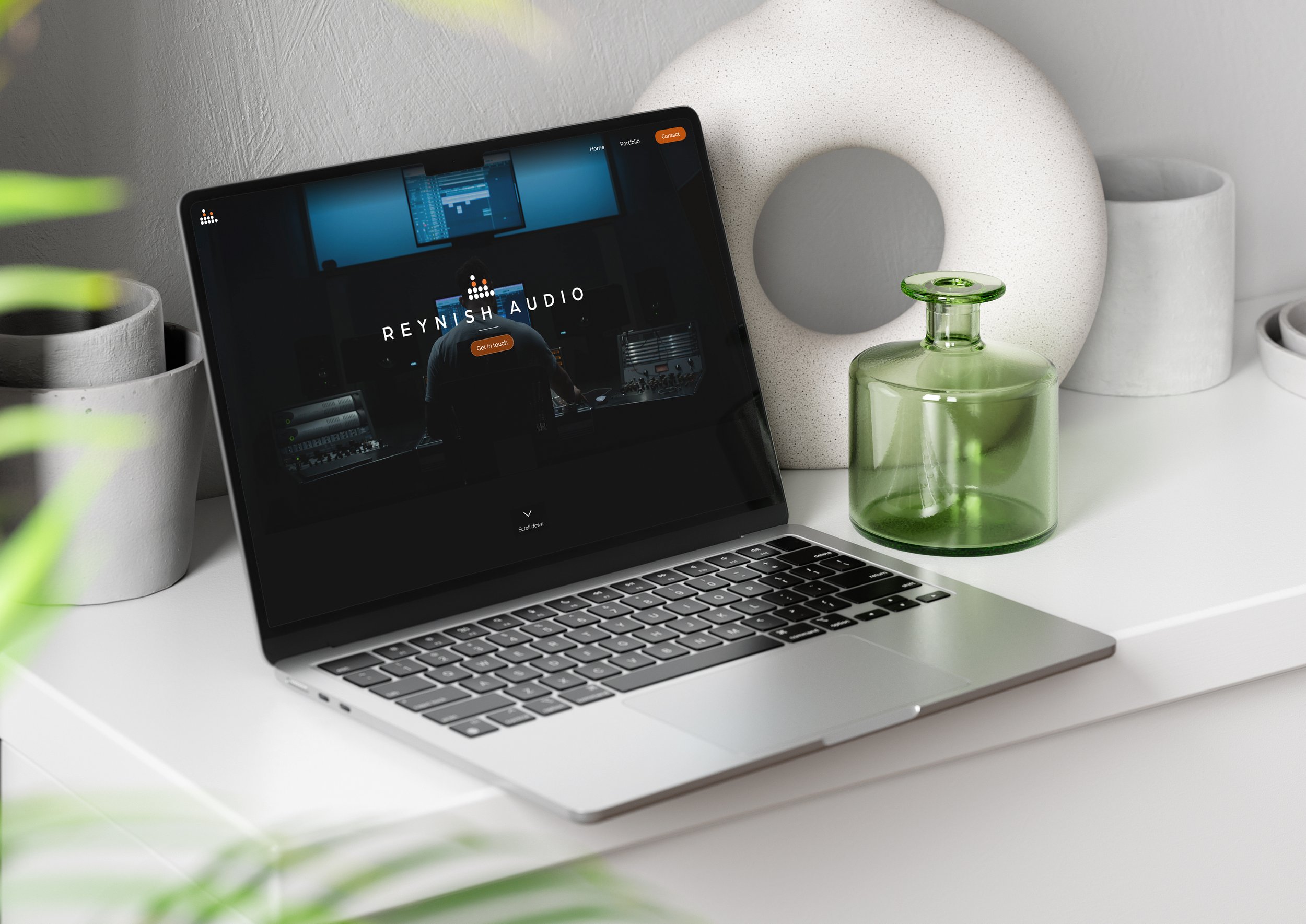
Reynish Audio

8
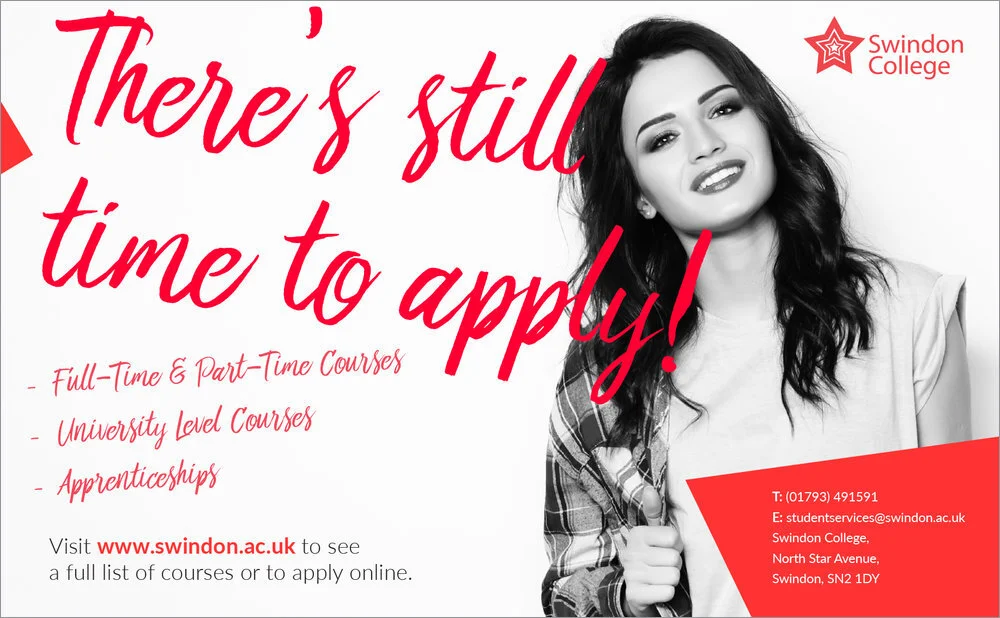
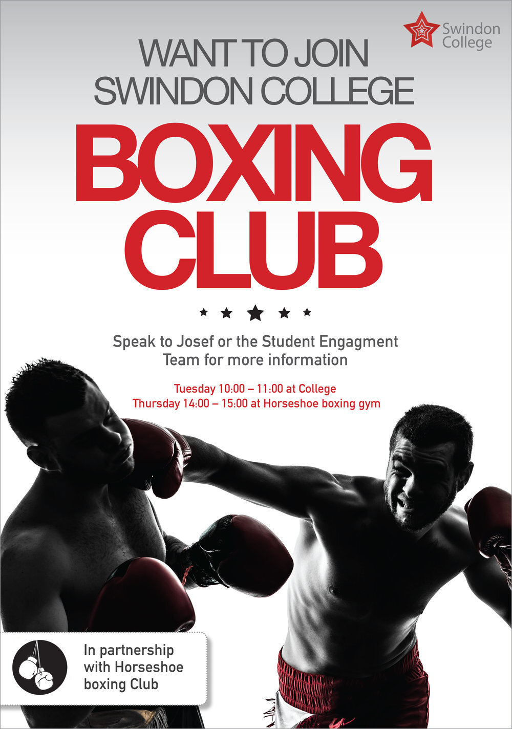
Swindon College - Portfolio

4
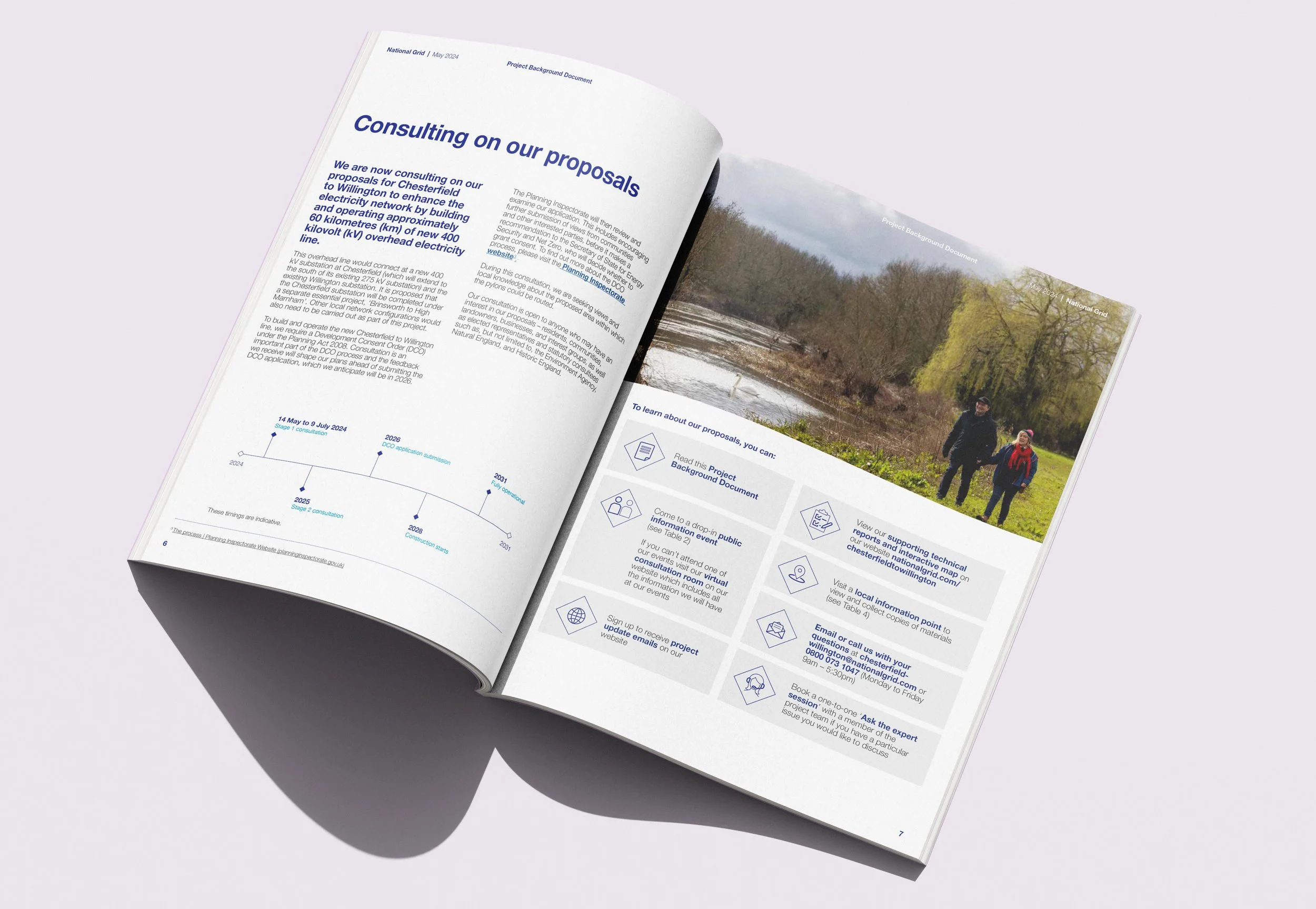
National Grid

16
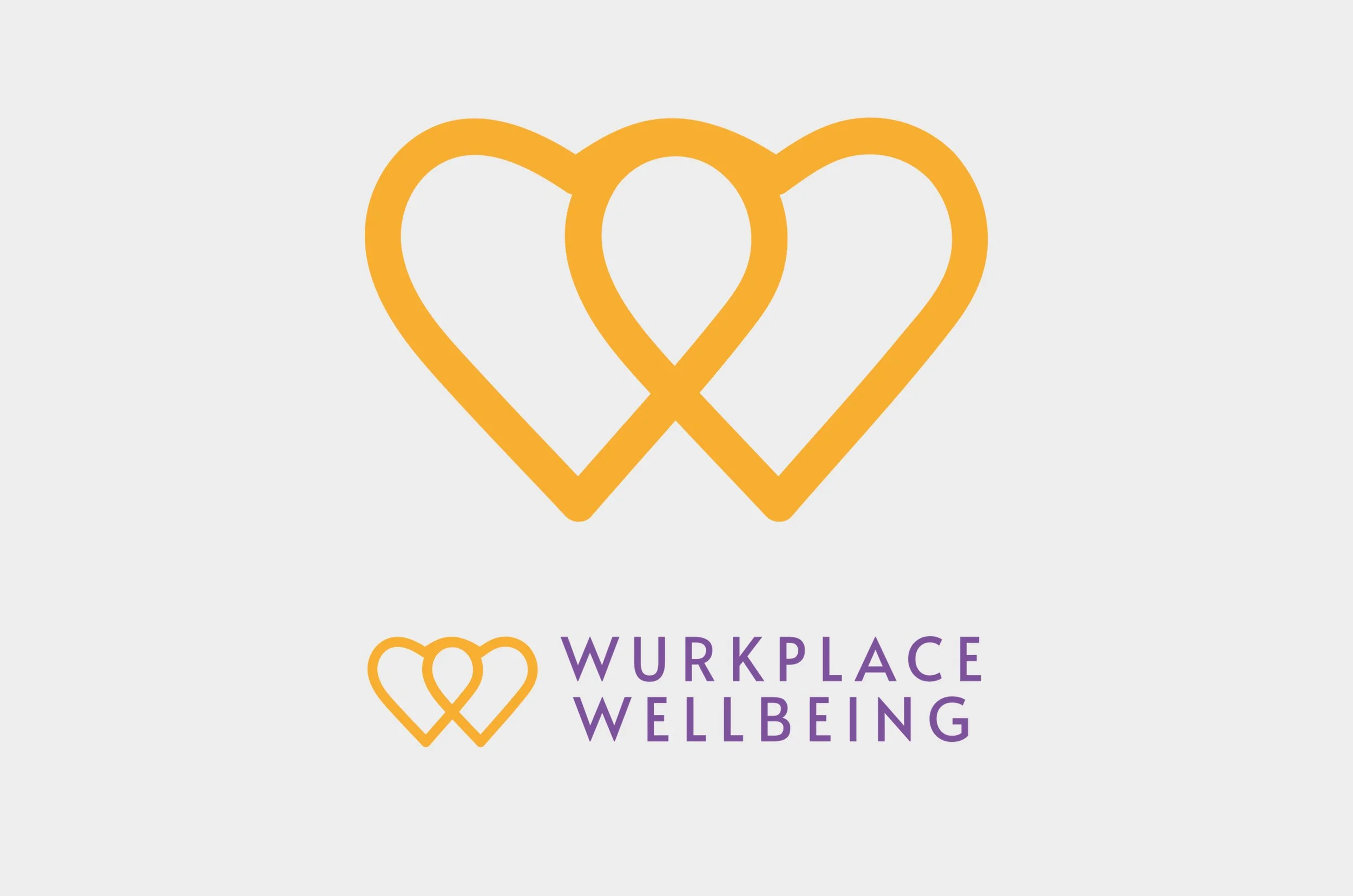
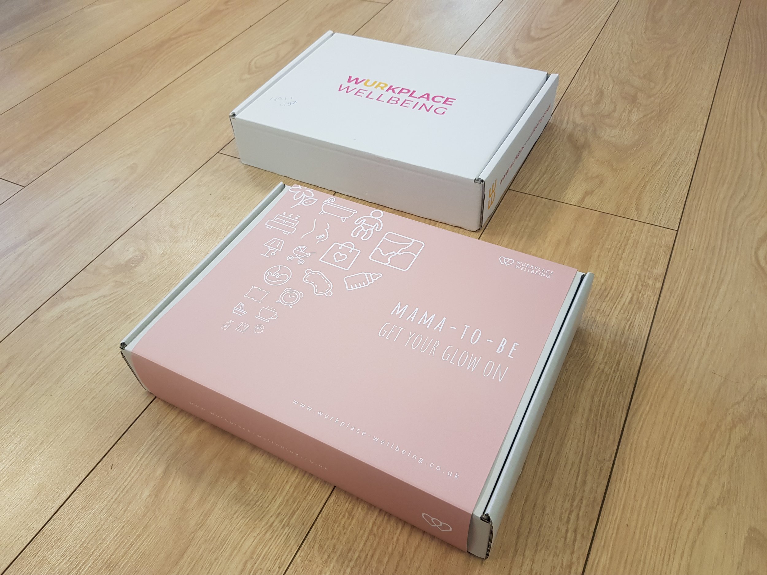
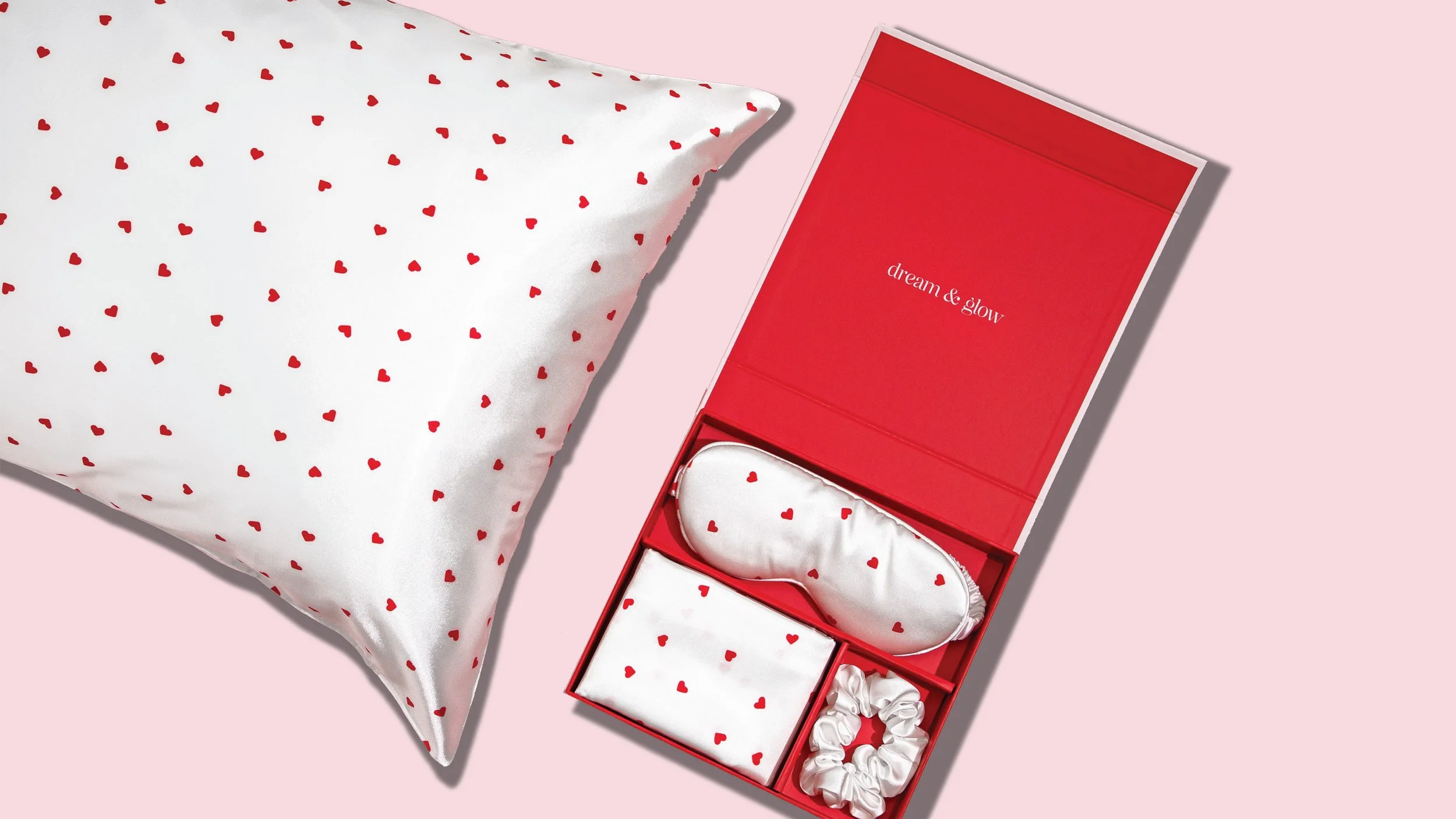
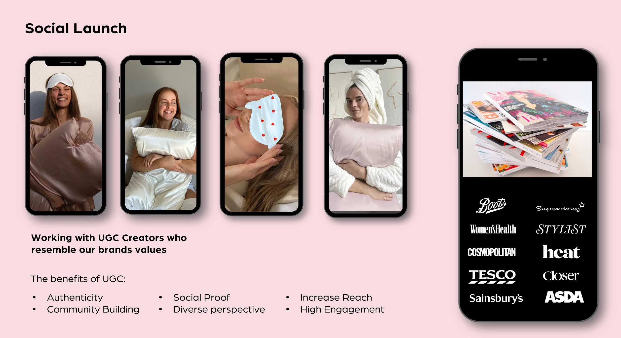
Wurkplace Wellbeing - UX & UI, Packaging, POS, Social media, photography & Exhibition graphics

19
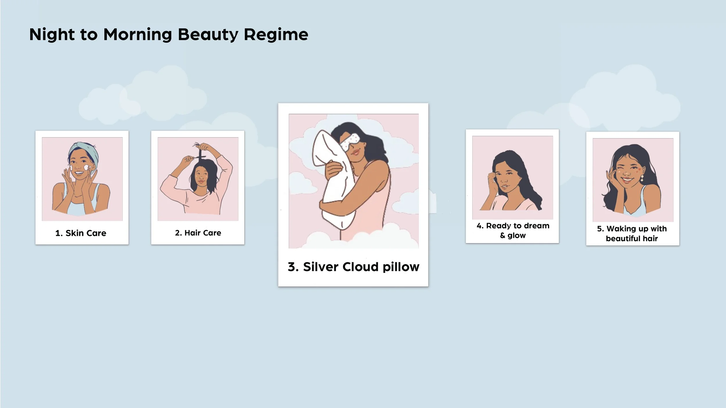
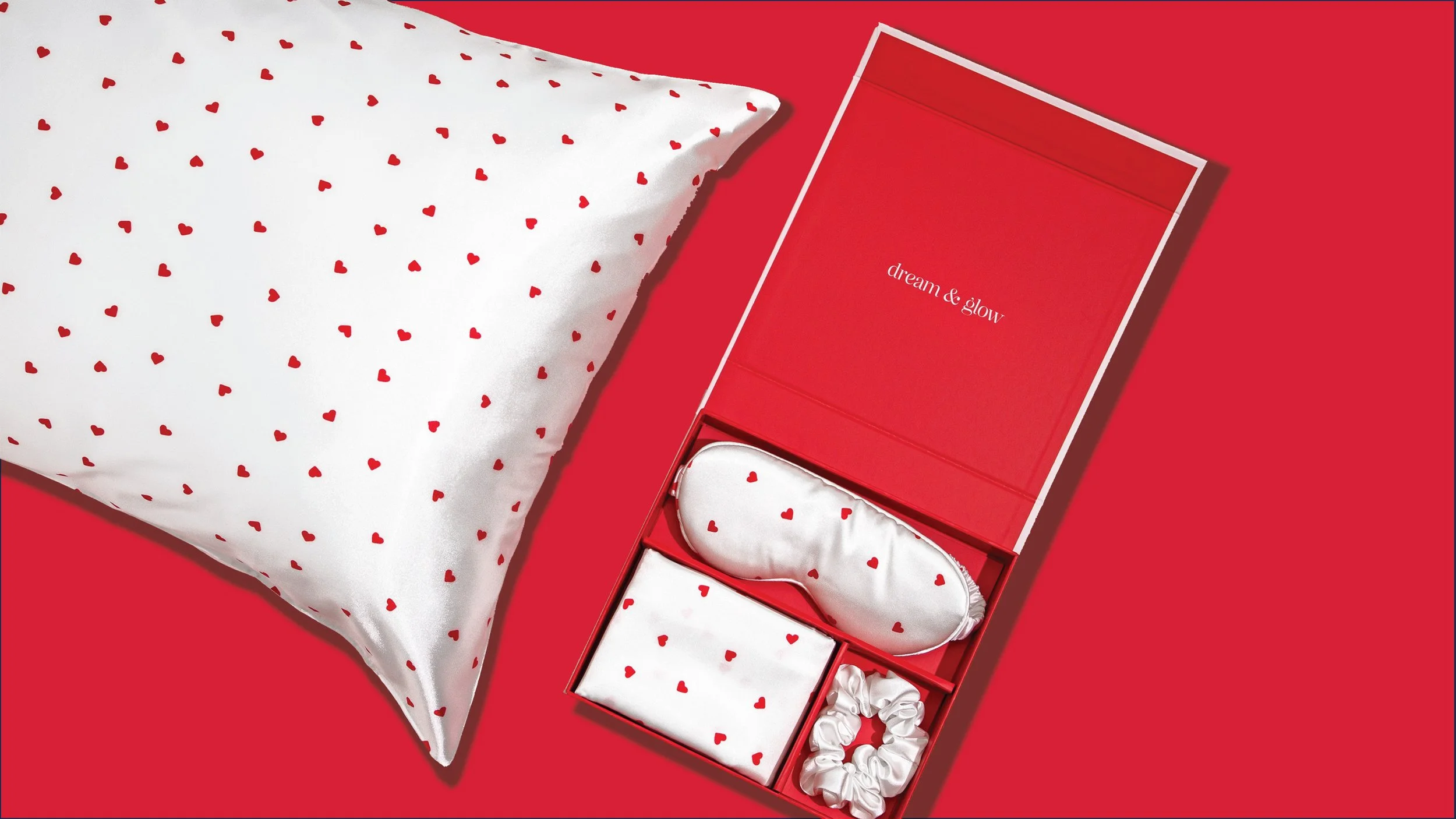
Silver Cloud Powerpoint Deck
8
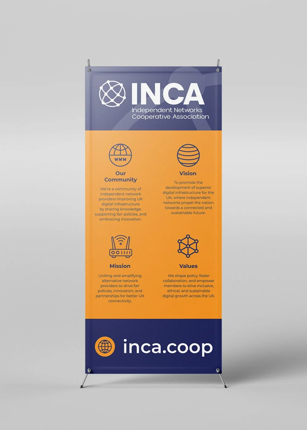
INCA

9
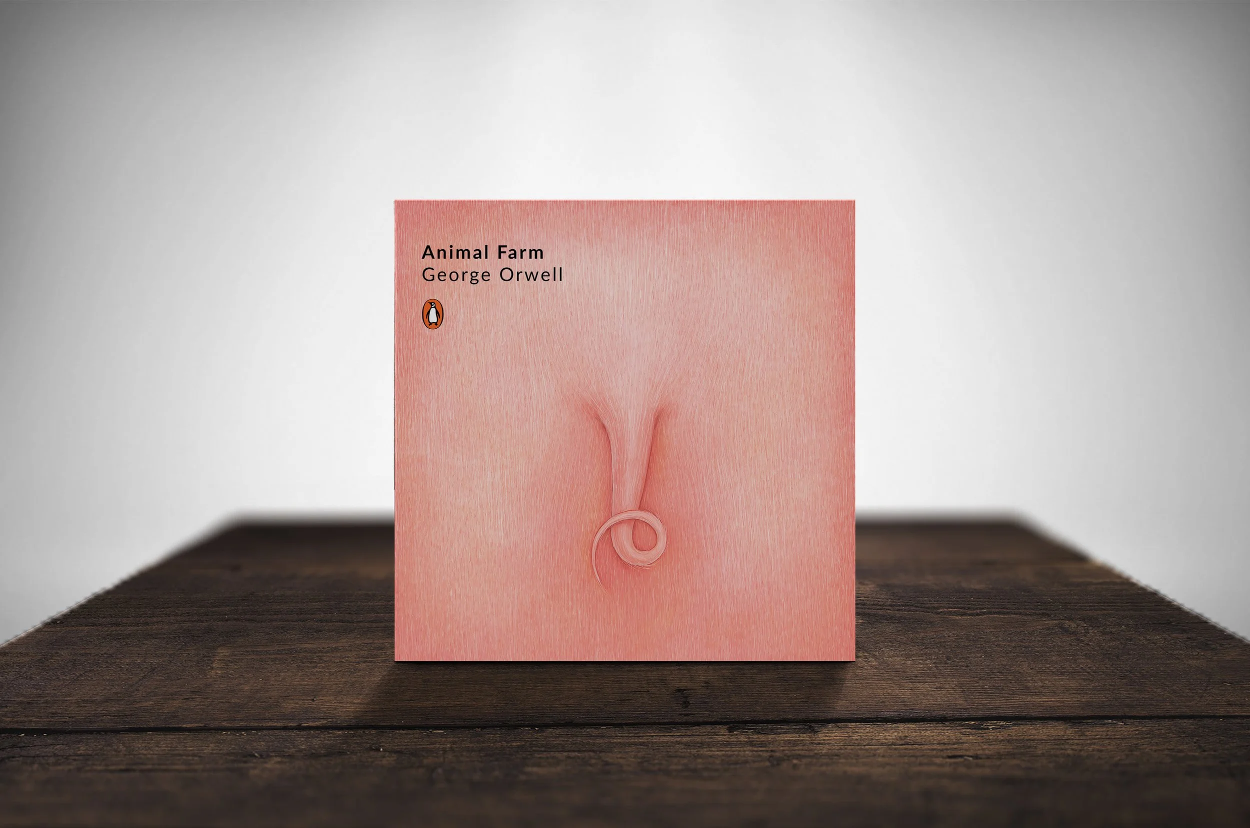
Book Jacket Designs

8
BRANDING

8
MORTGAGED. Brand Identity & UX, UI & Web Design

11
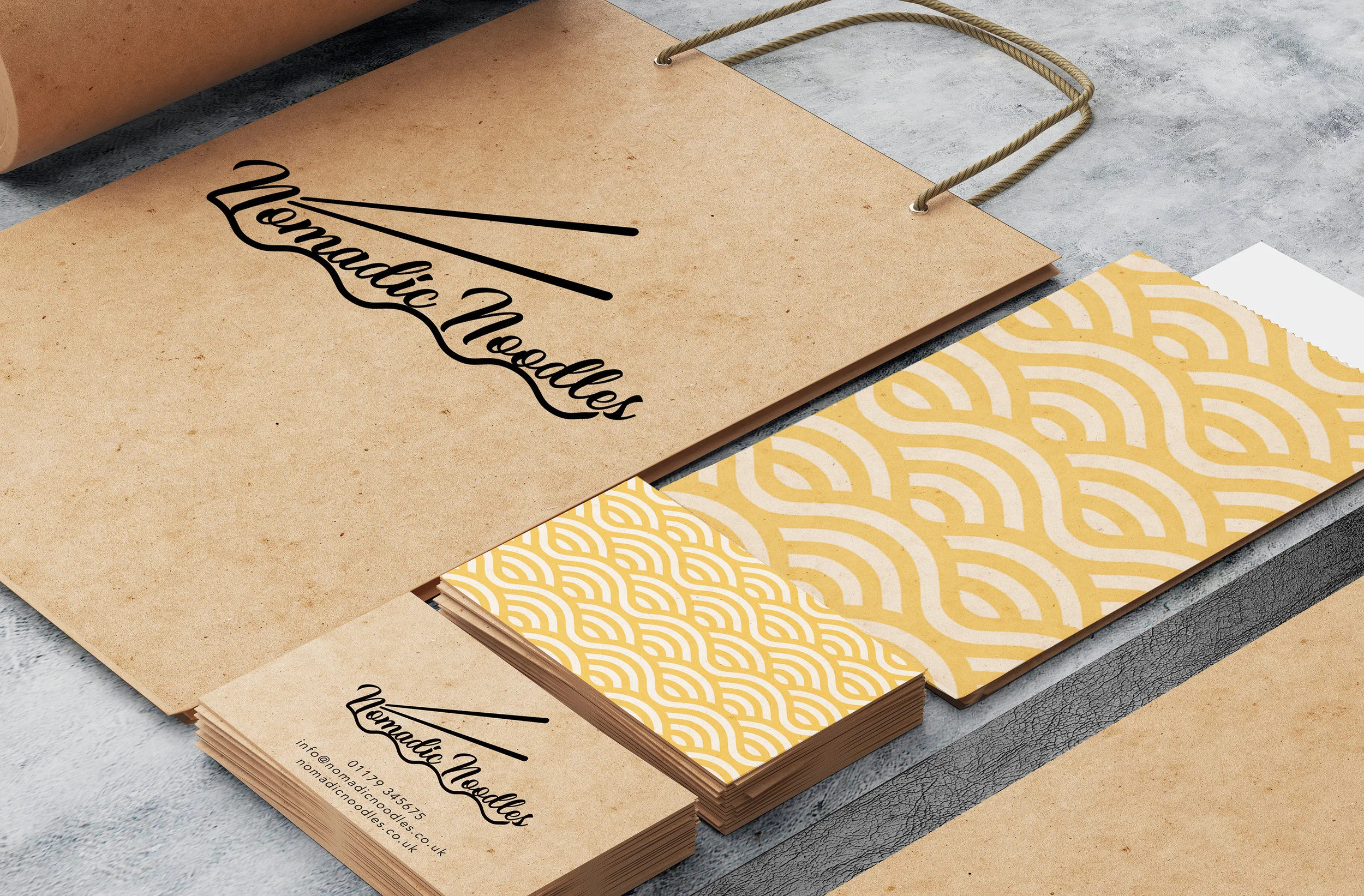
Nomadic Noodles - Brand identity, app design, UX & UI design
5
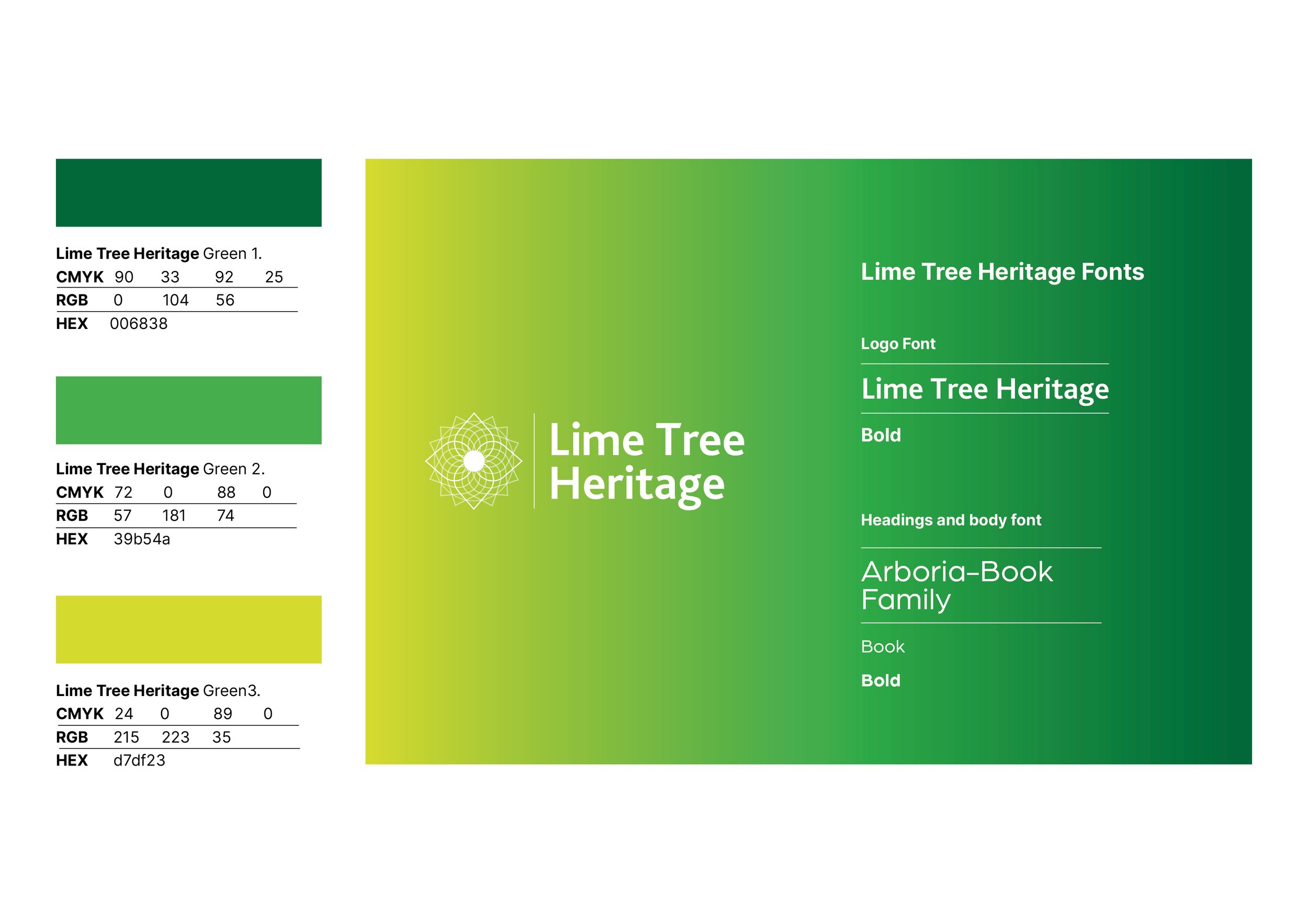
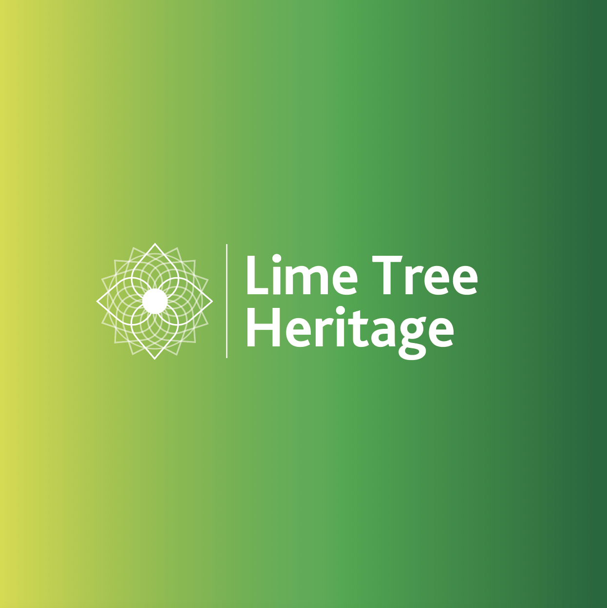
Lime Tree Heritage Brand

10
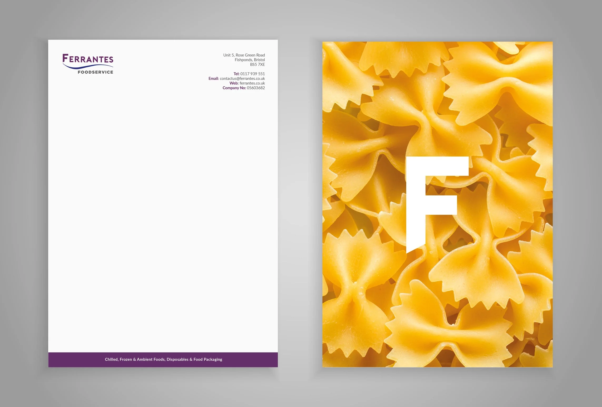
Ferrantes - Brand Identity & Website Redesign

8
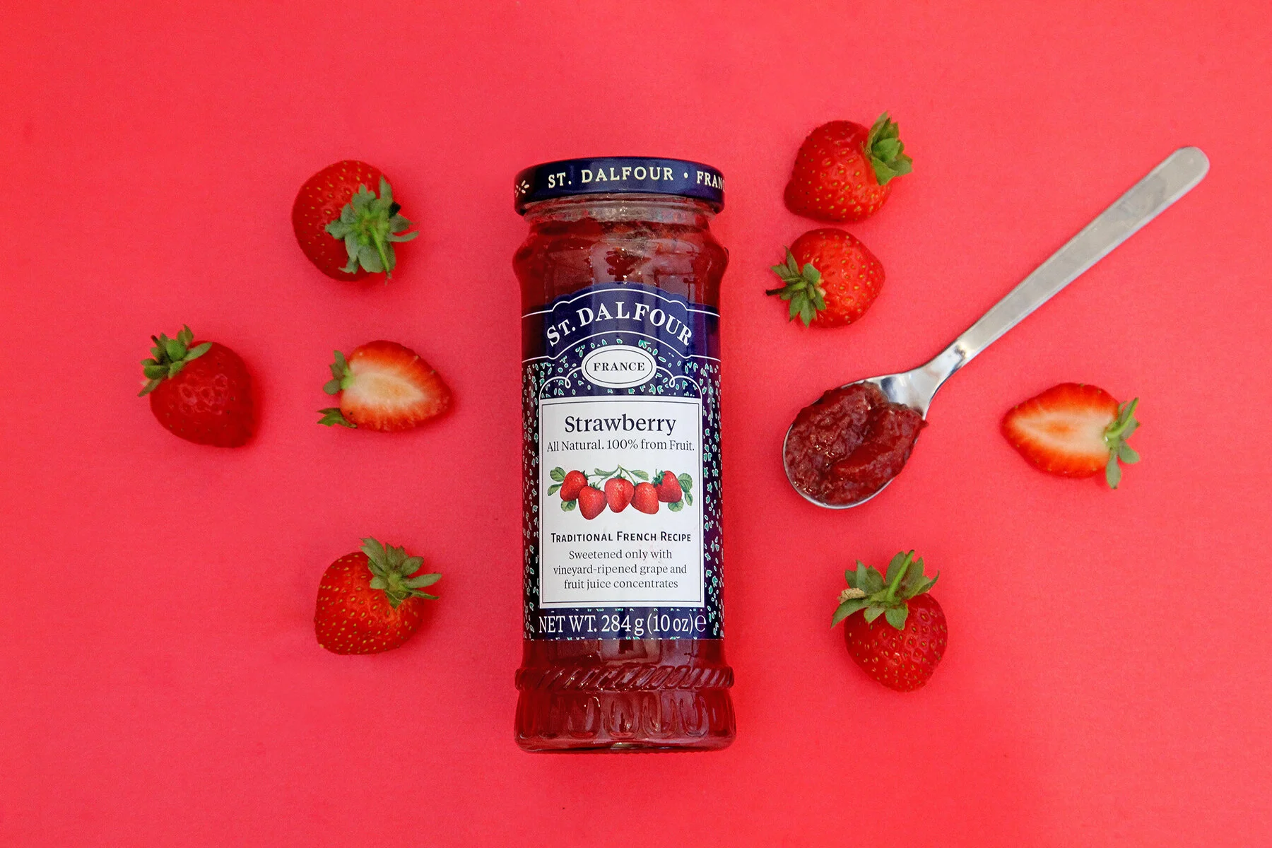
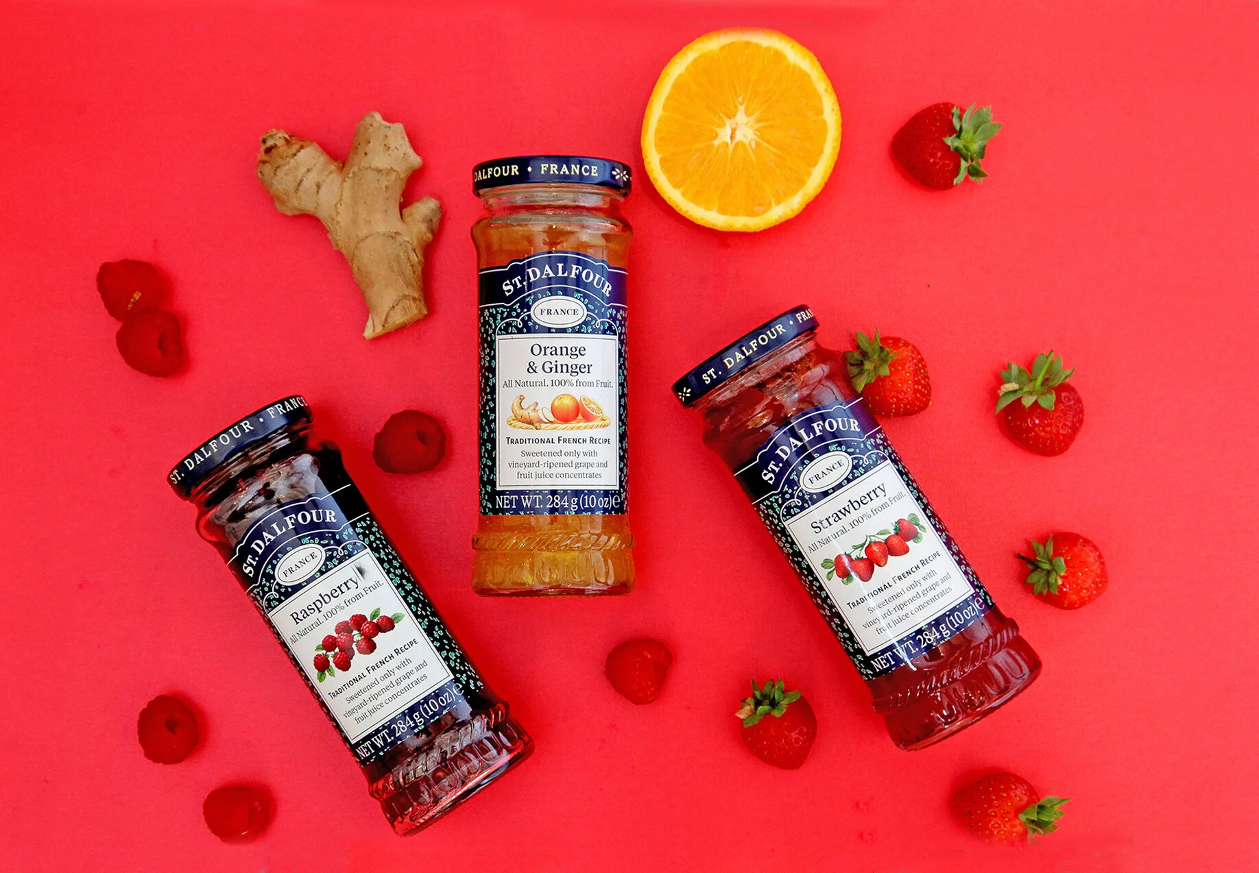
Product Photography

14
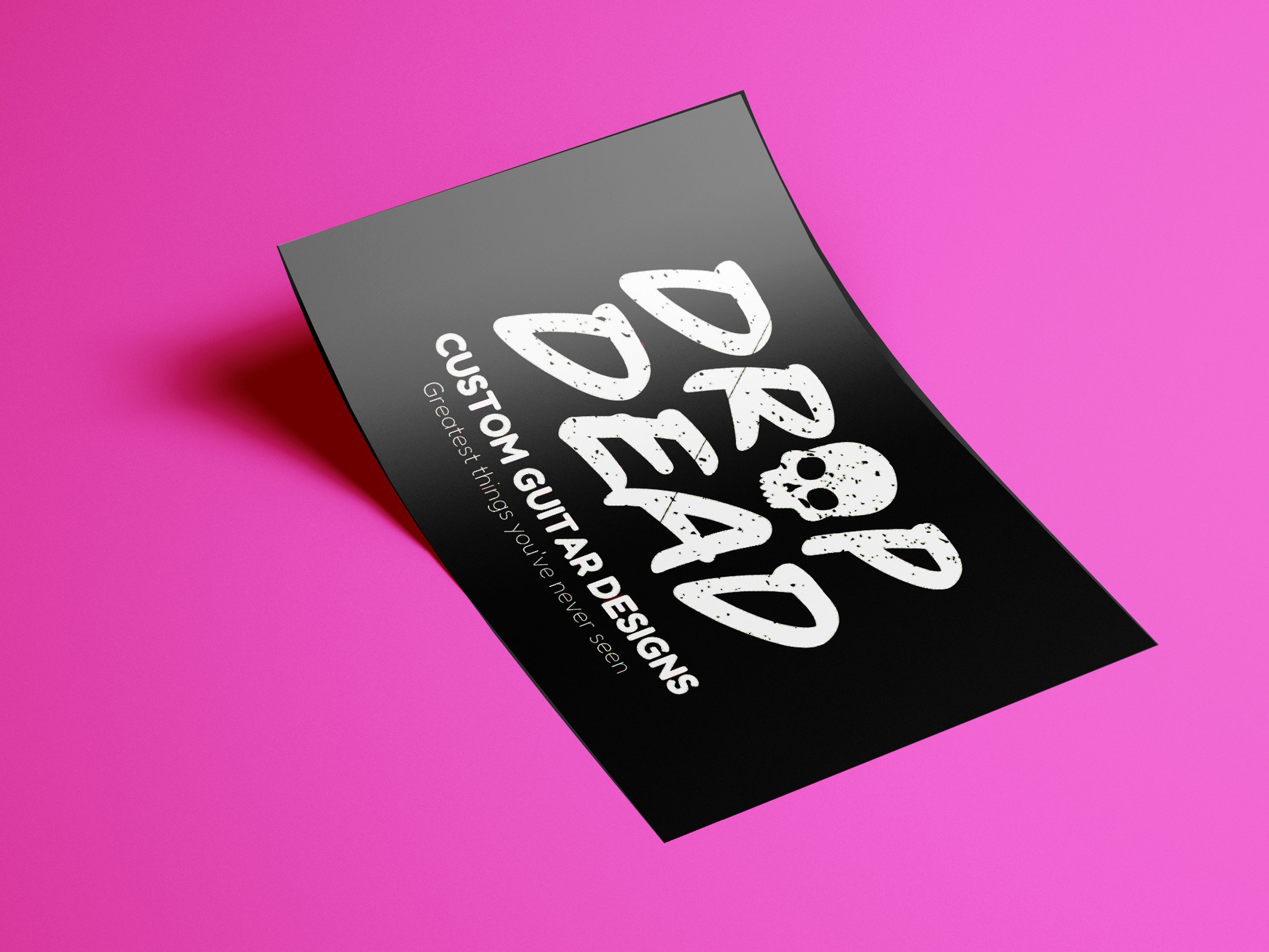
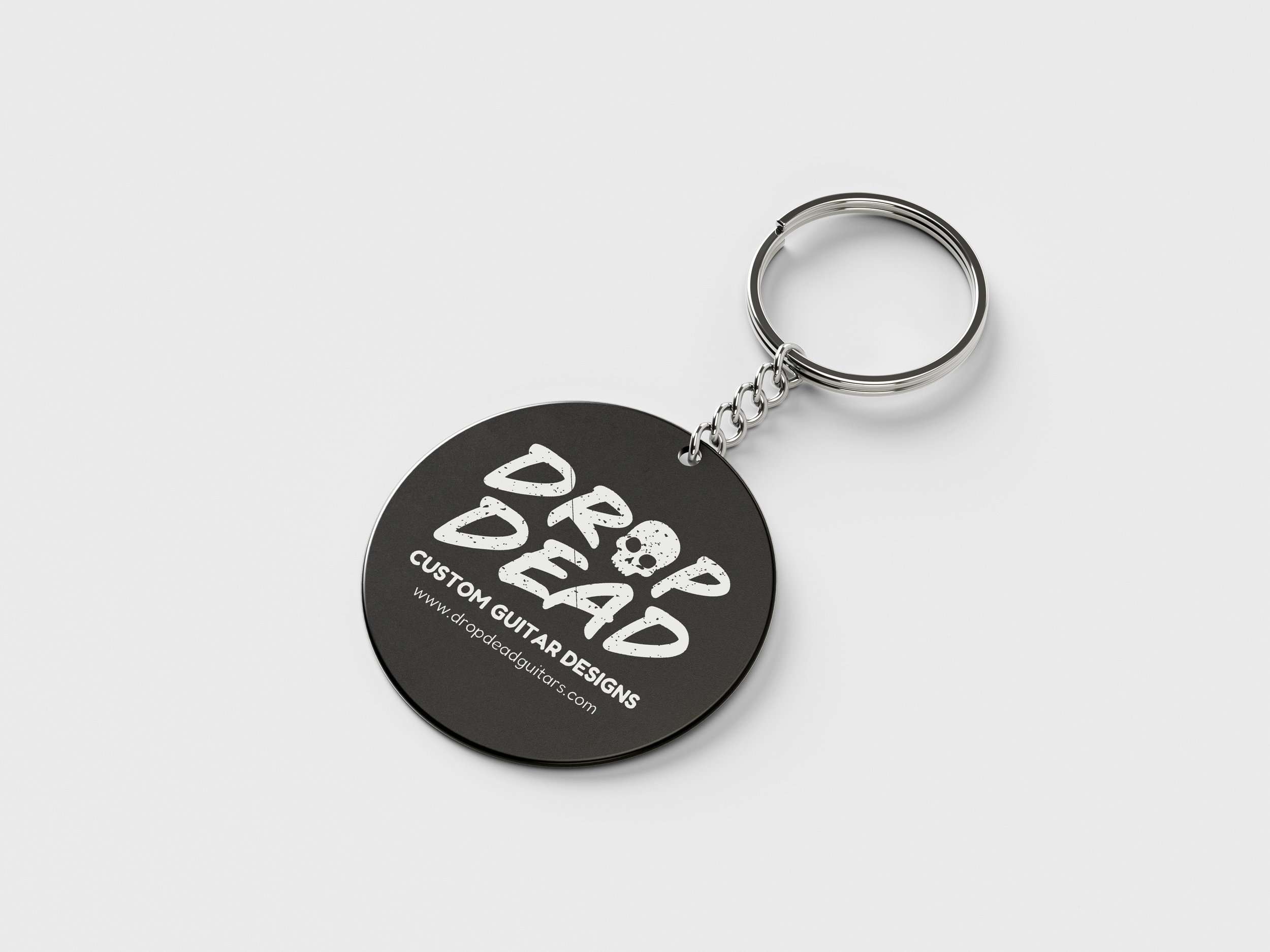
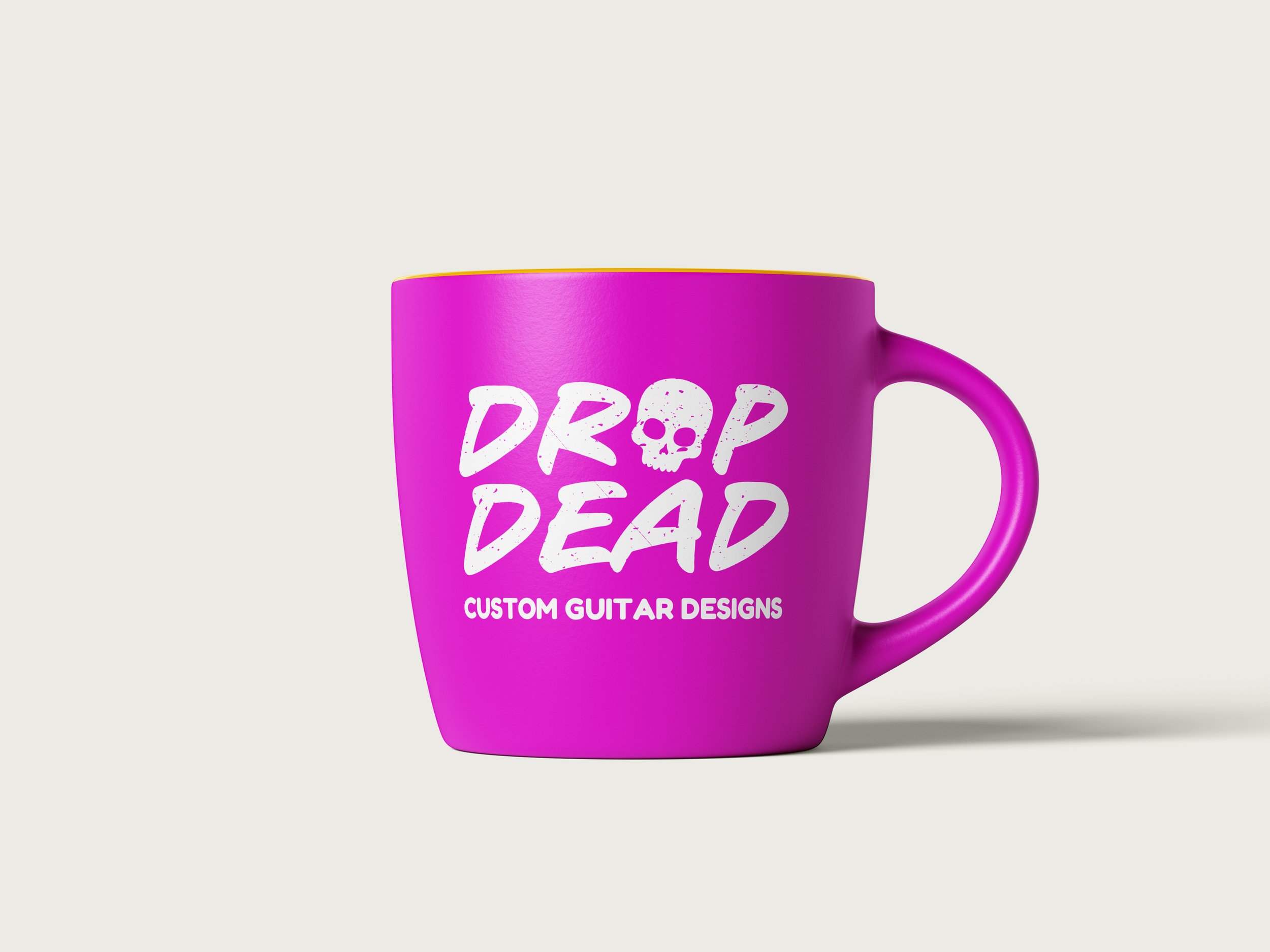
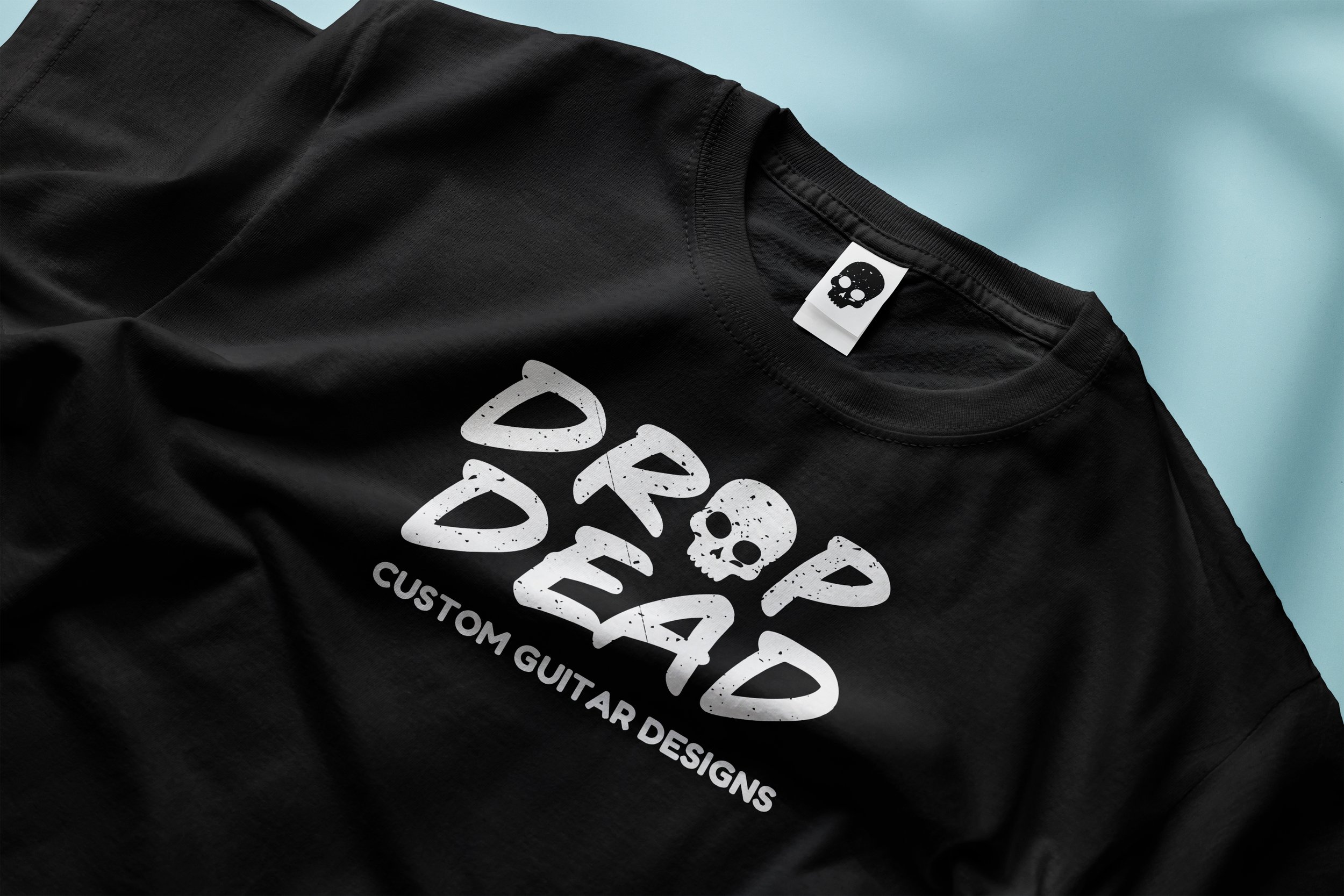
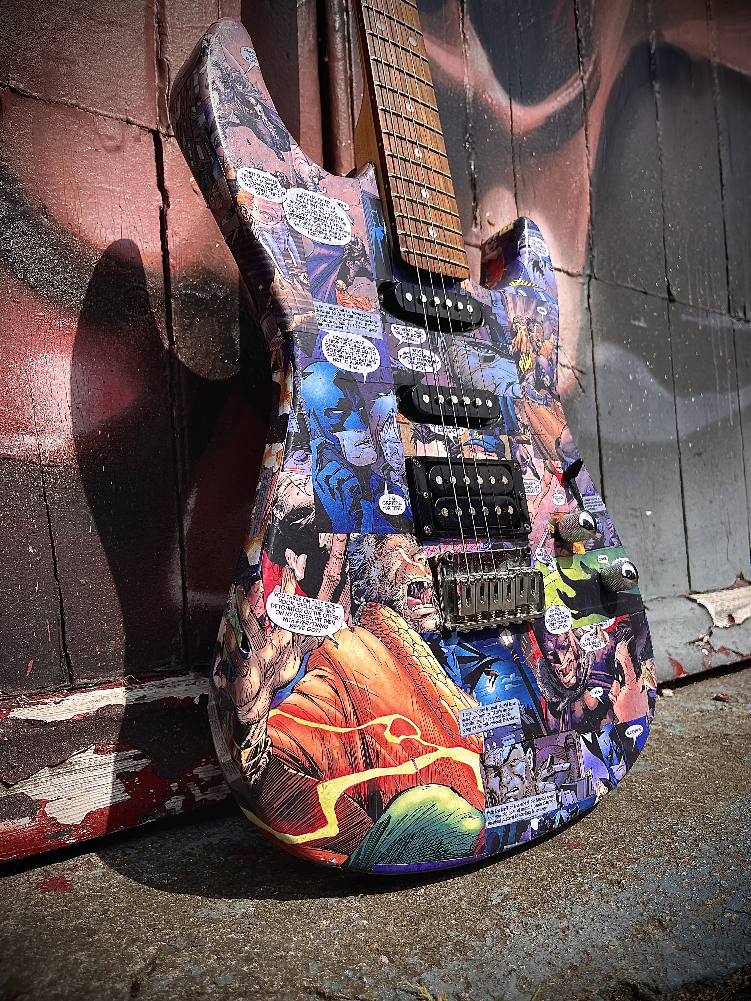
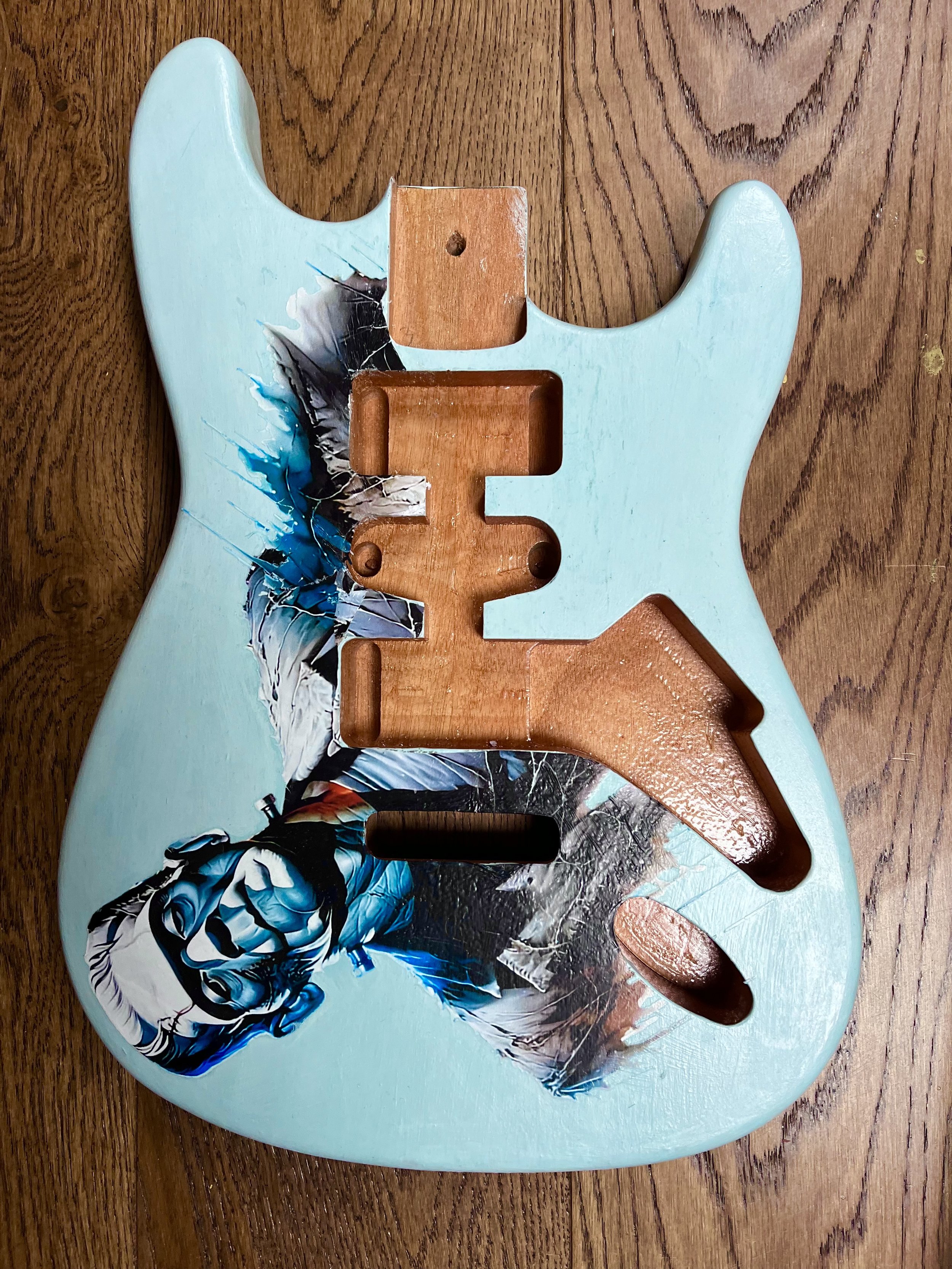
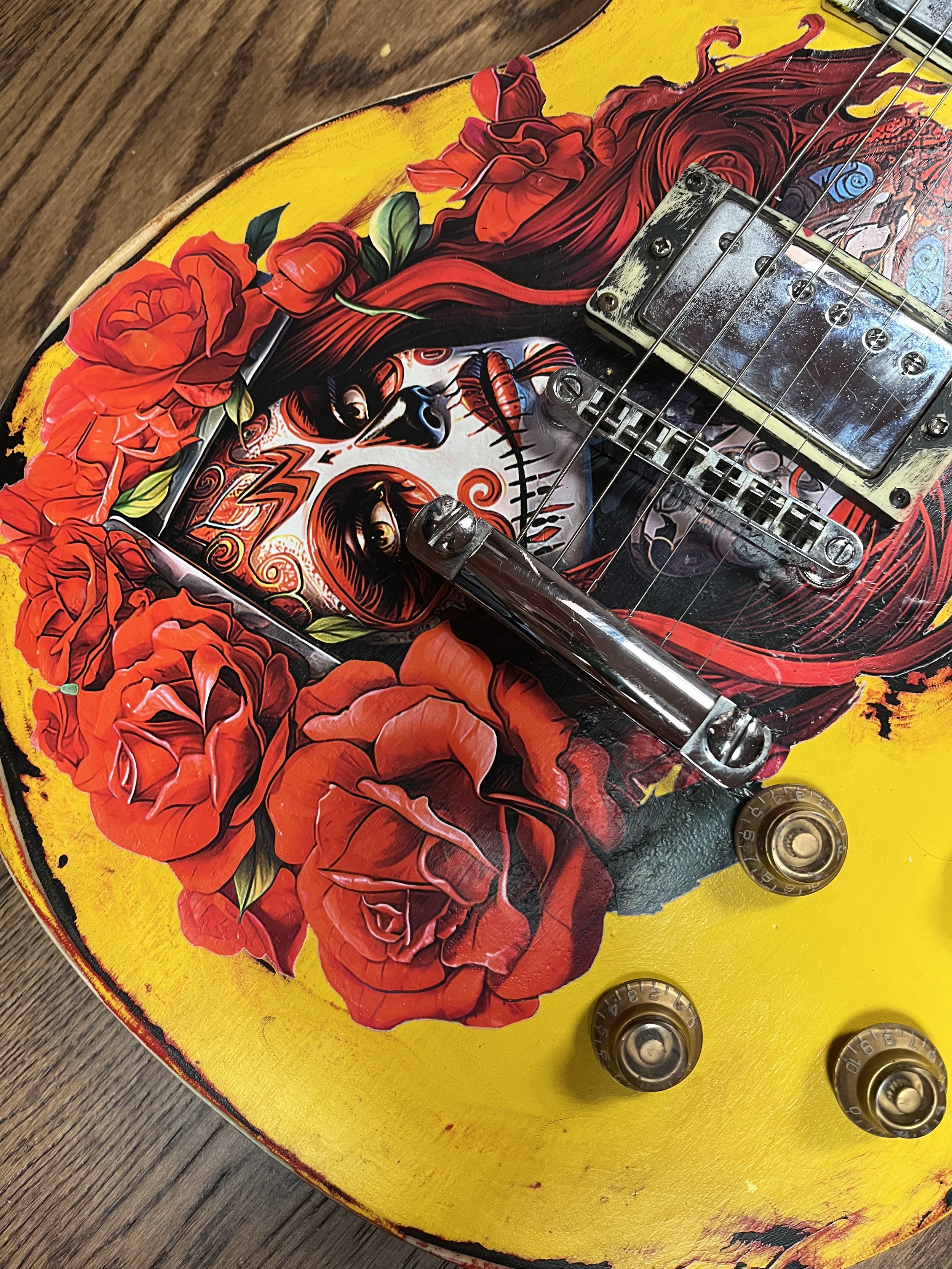
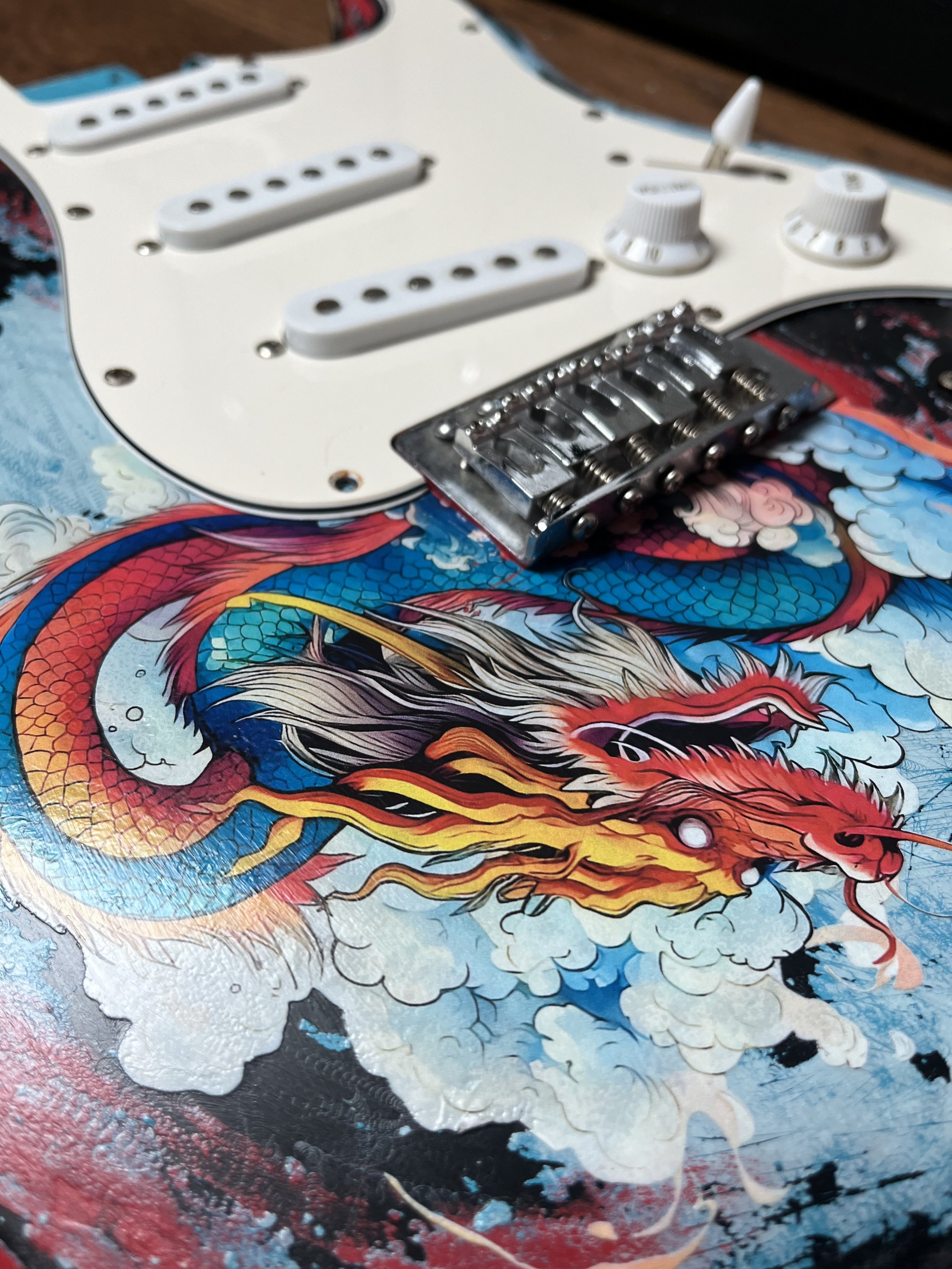
Drop Dead Guitars

11
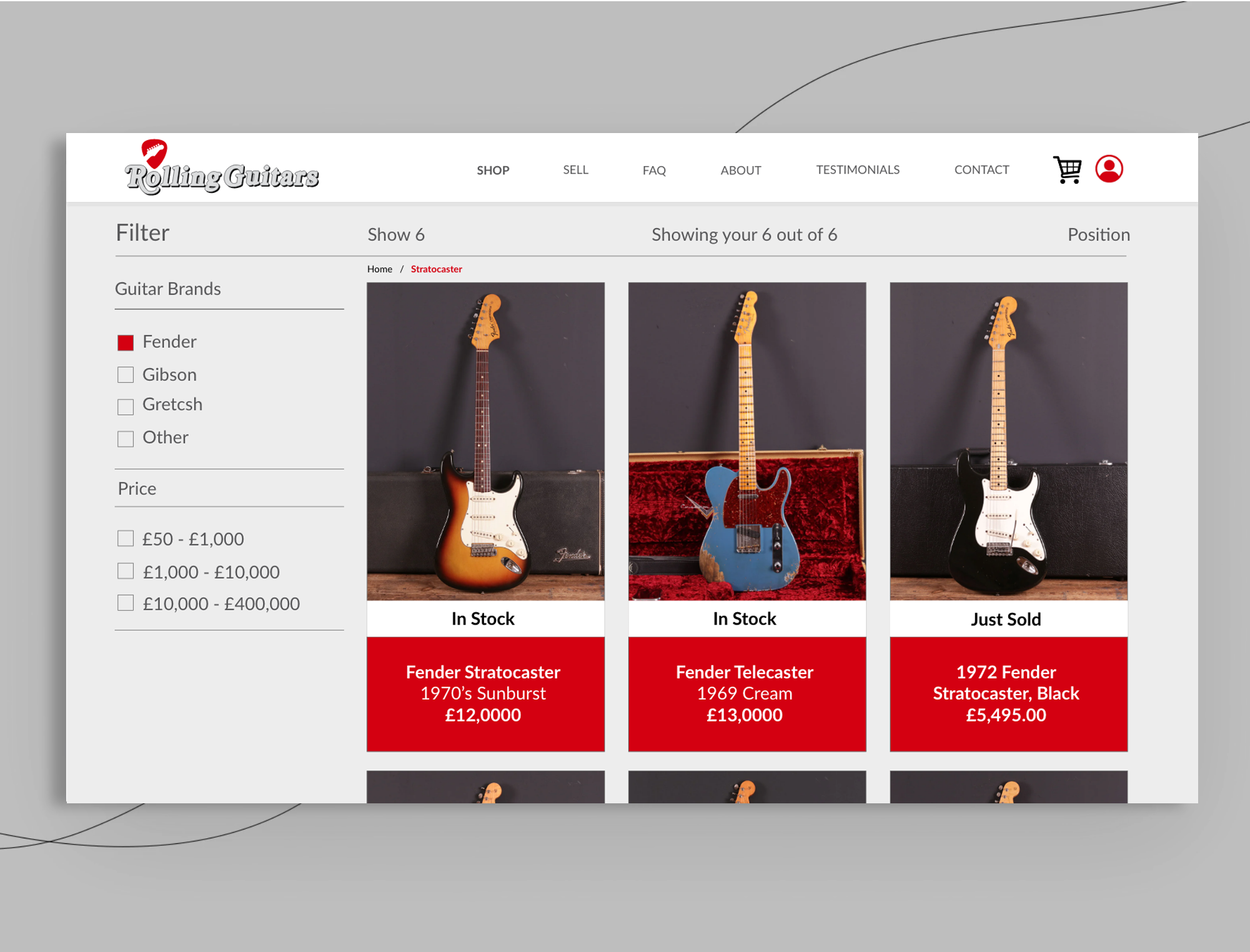
Rolling Guitars - UX UI, Branding, Stationary design

3
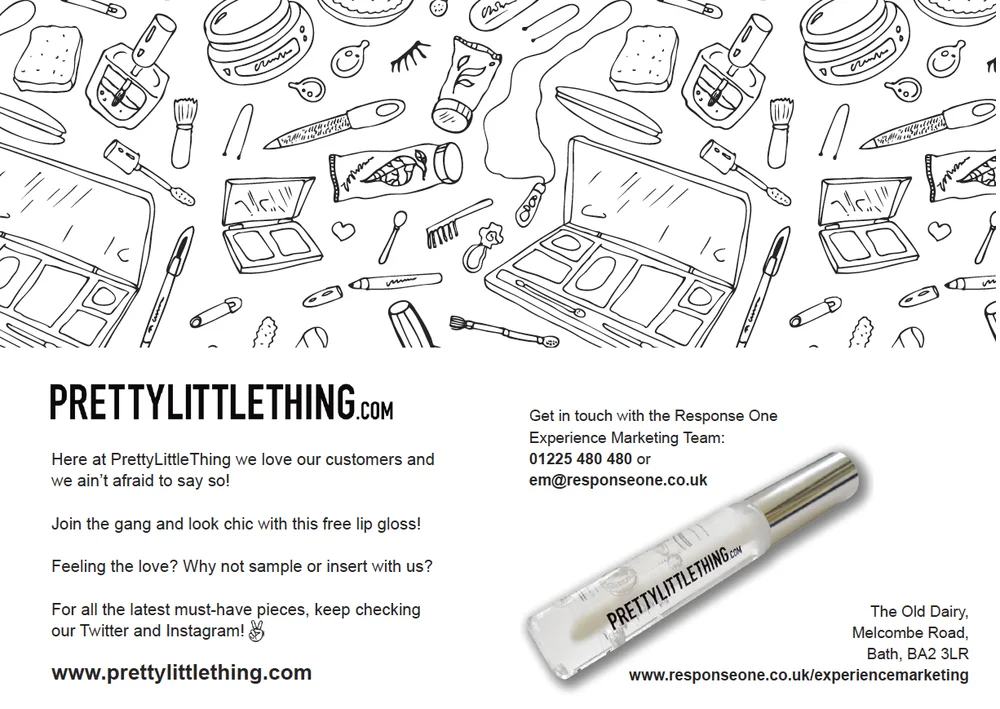
PRETTYLITTLETHING.com - Sampling Graphics and leaflet design

15
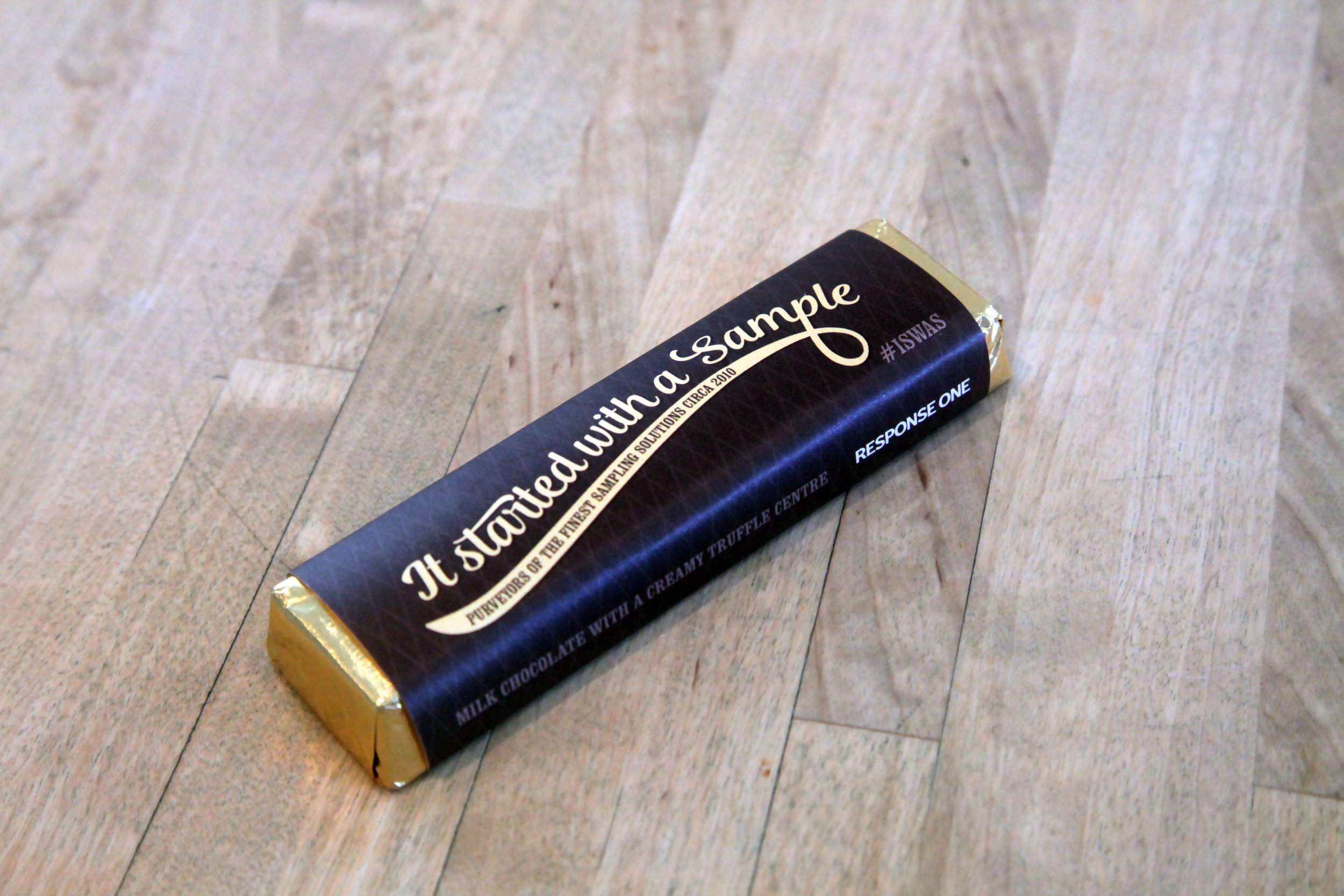
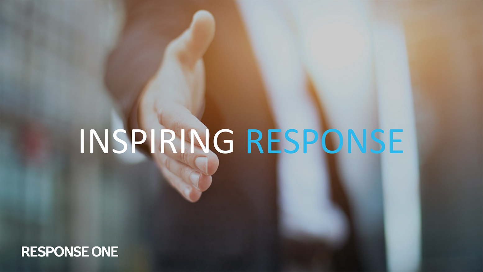
Response One - Portfolio
11
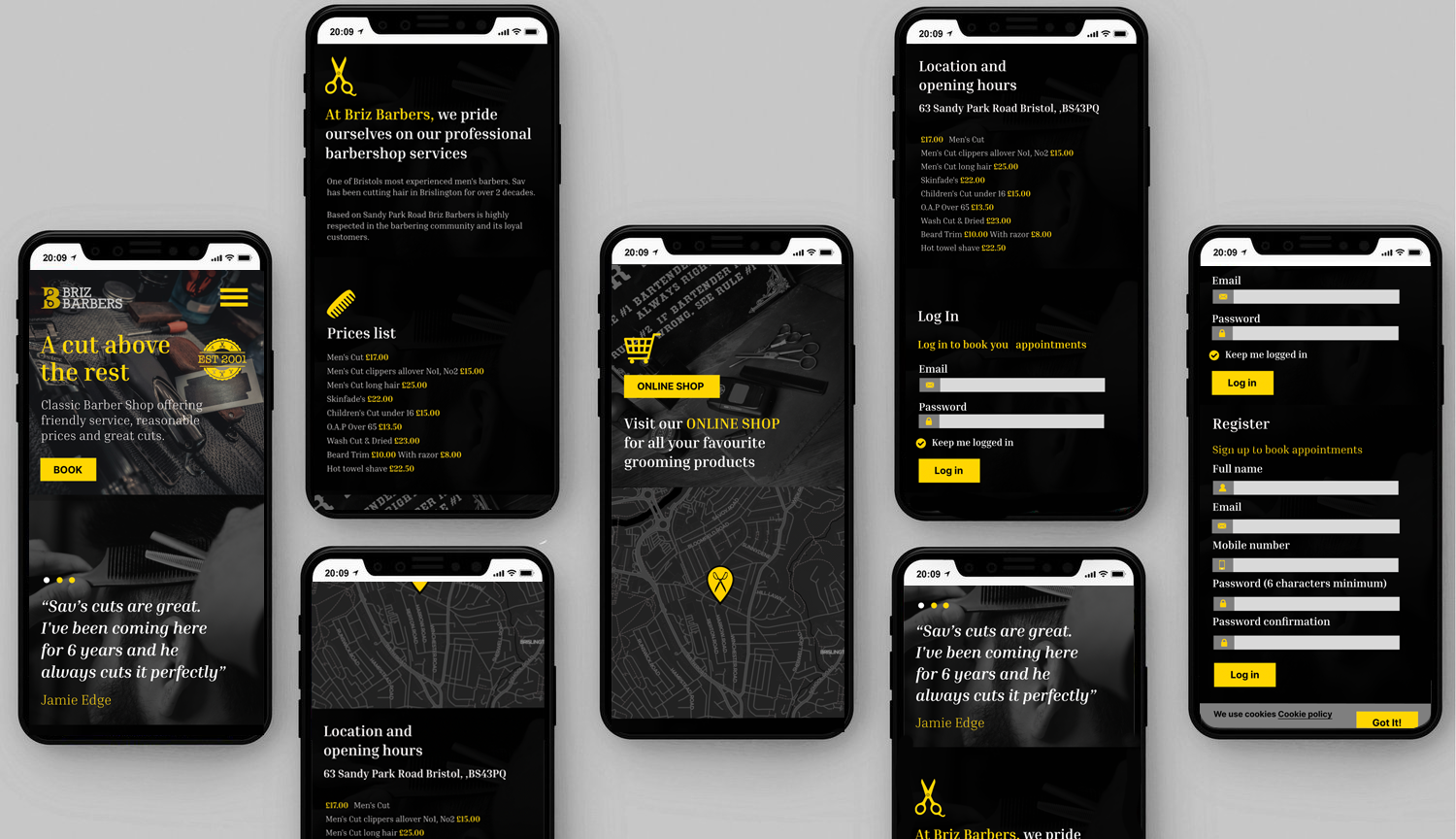
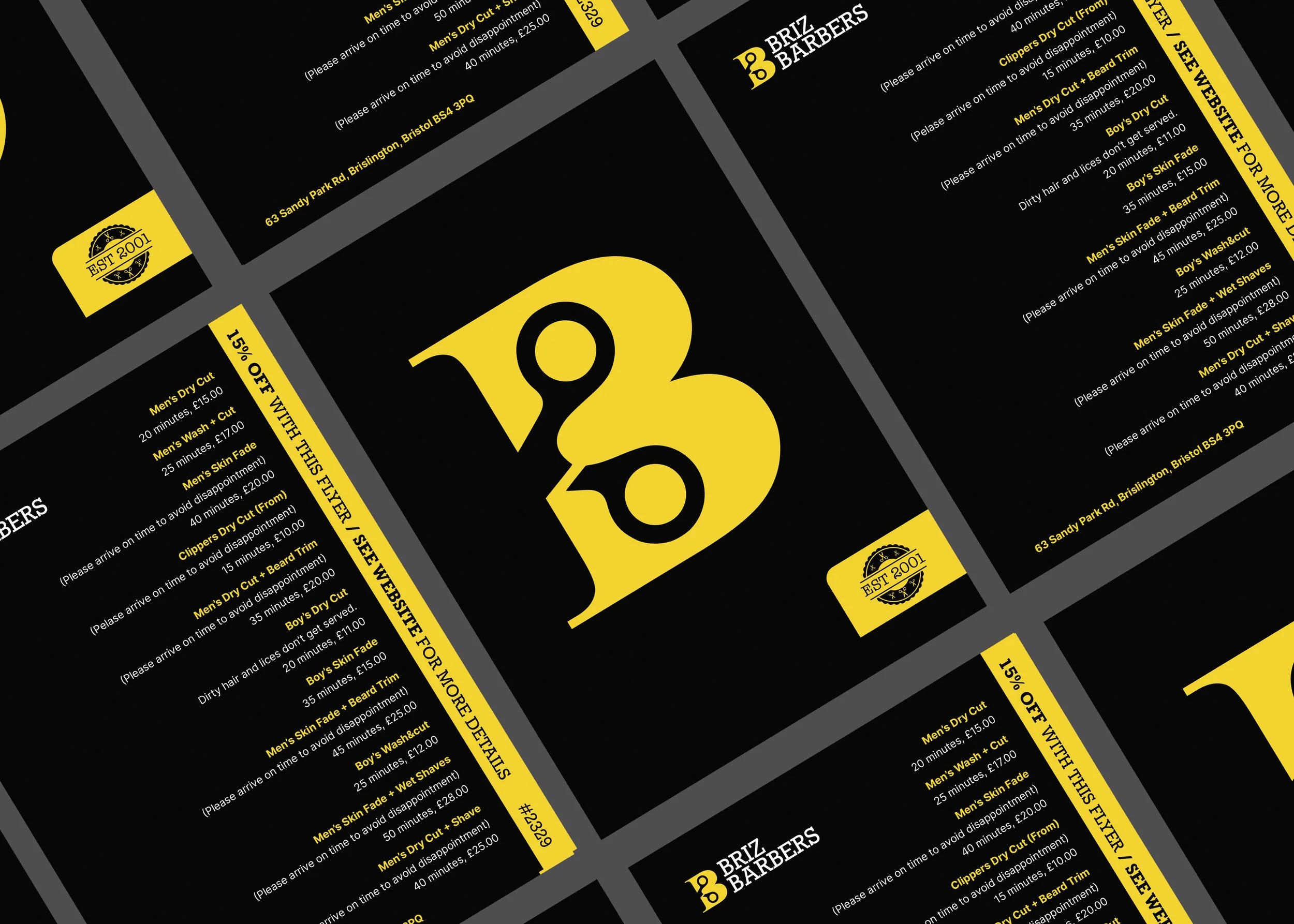
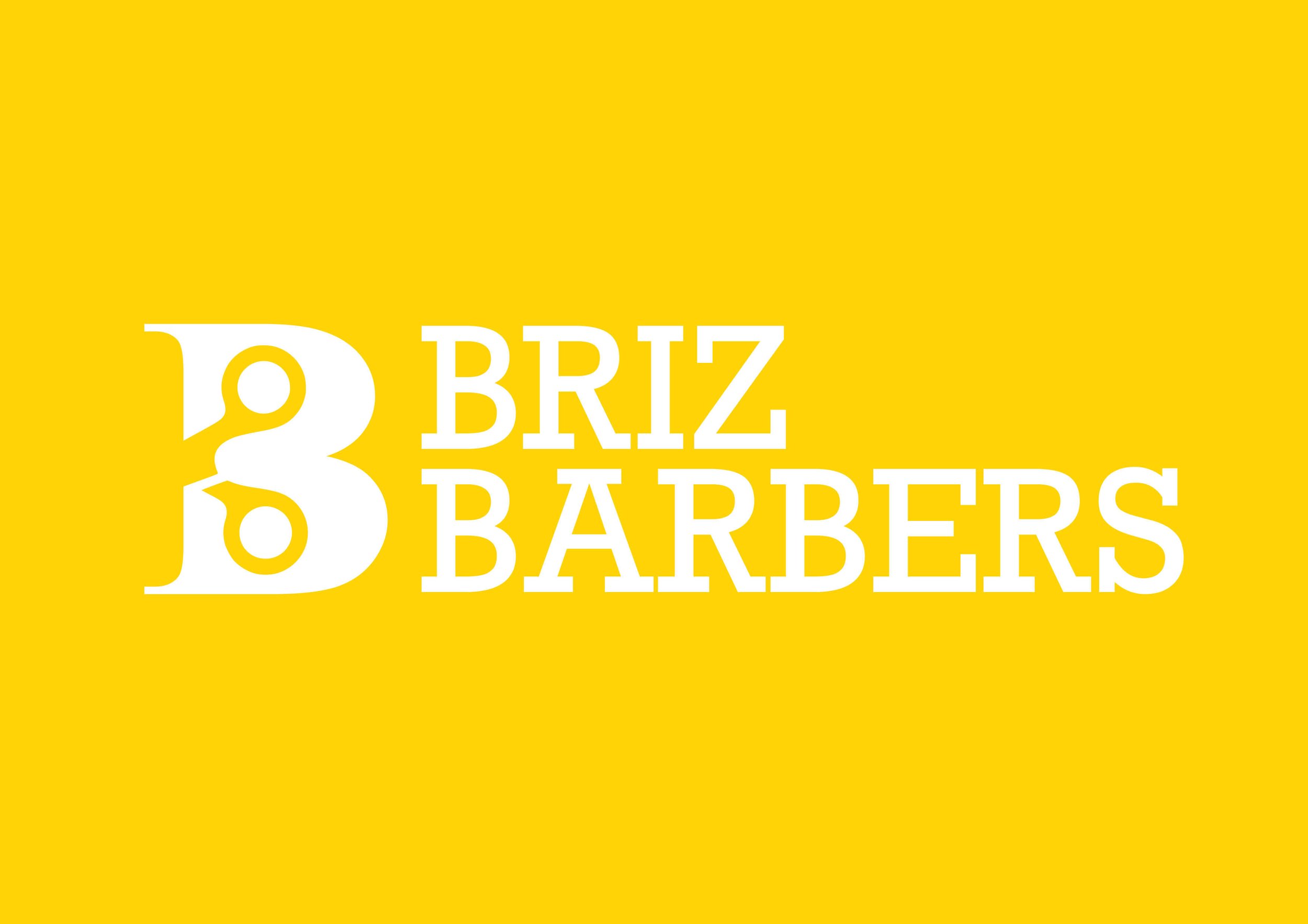
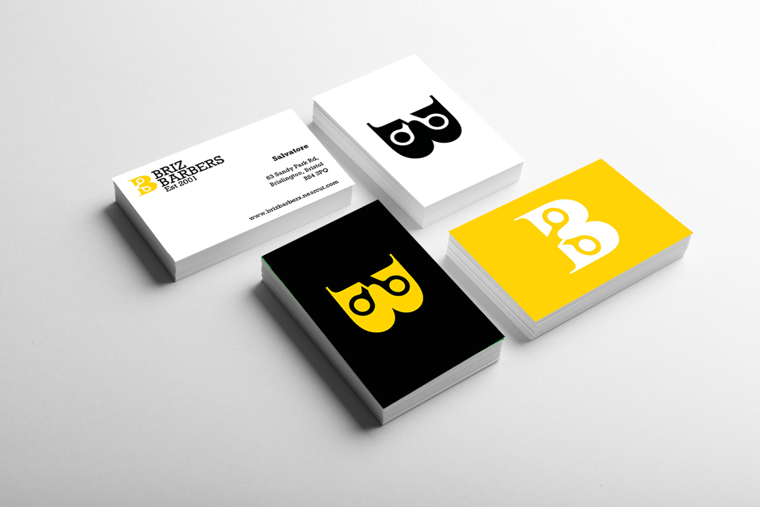
Briz Barbers - Brand identity , UX & UI & Social Media

9
Brochure and presentation graphics - Branded3

2
Etex Website Redesign

26
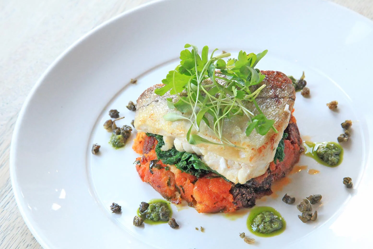
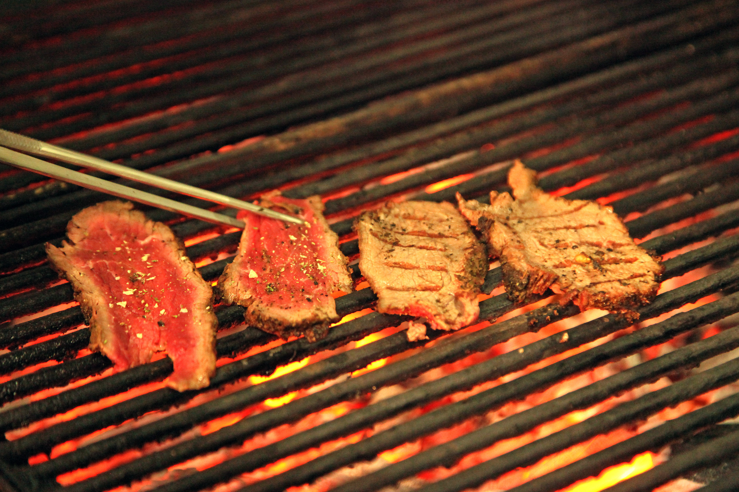
Food Photography Bristol

4
Corporate Portraits

7
Food Story Boards

5
Maya and Bluey's Moon Adventure - Illustraion and book concept

68
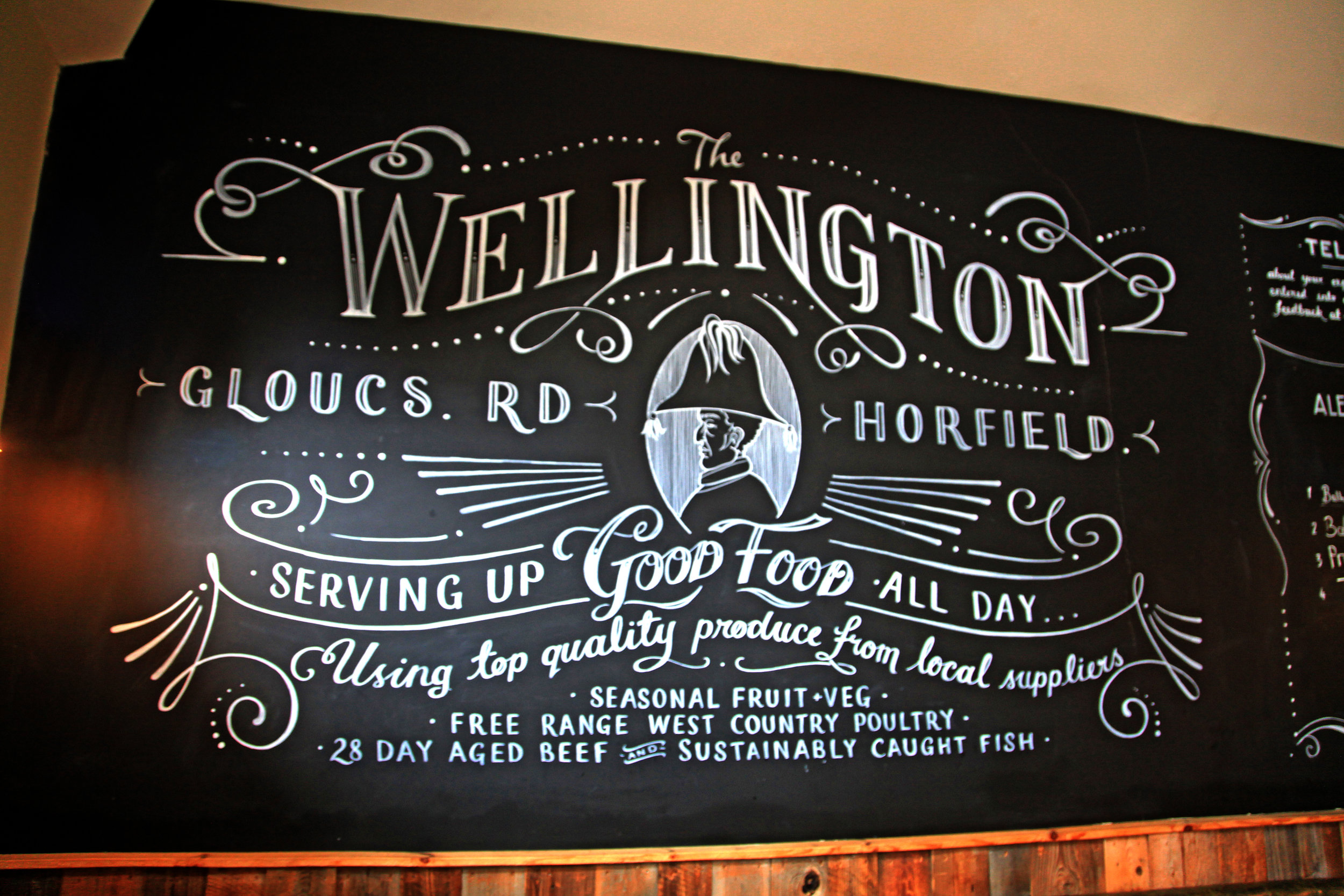
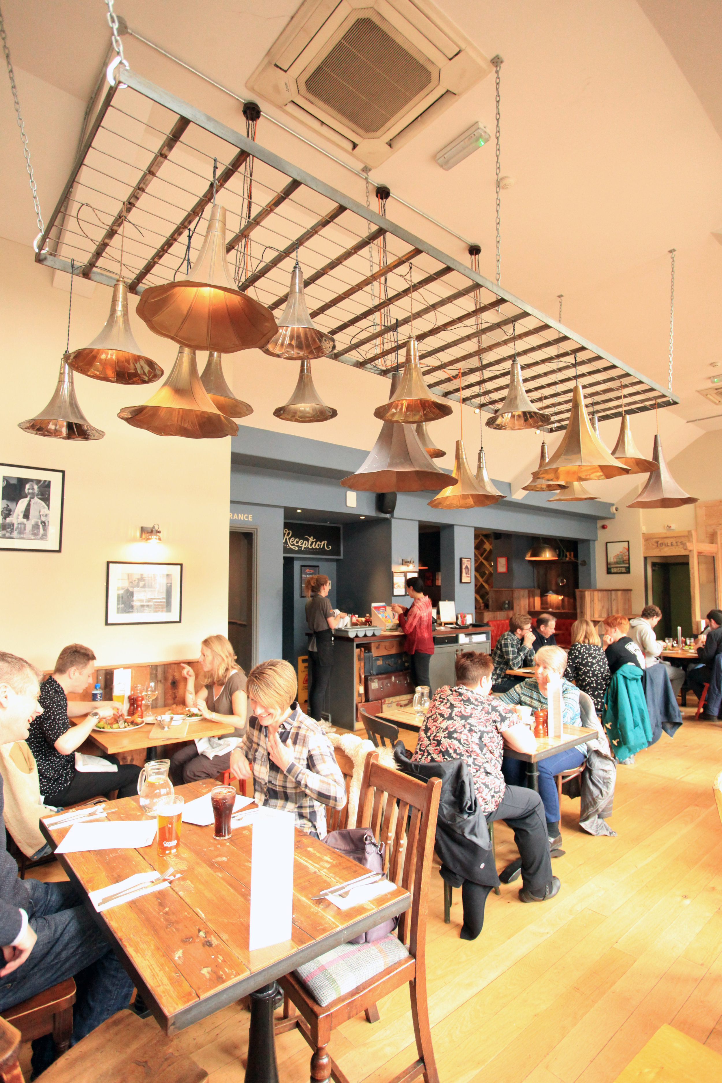
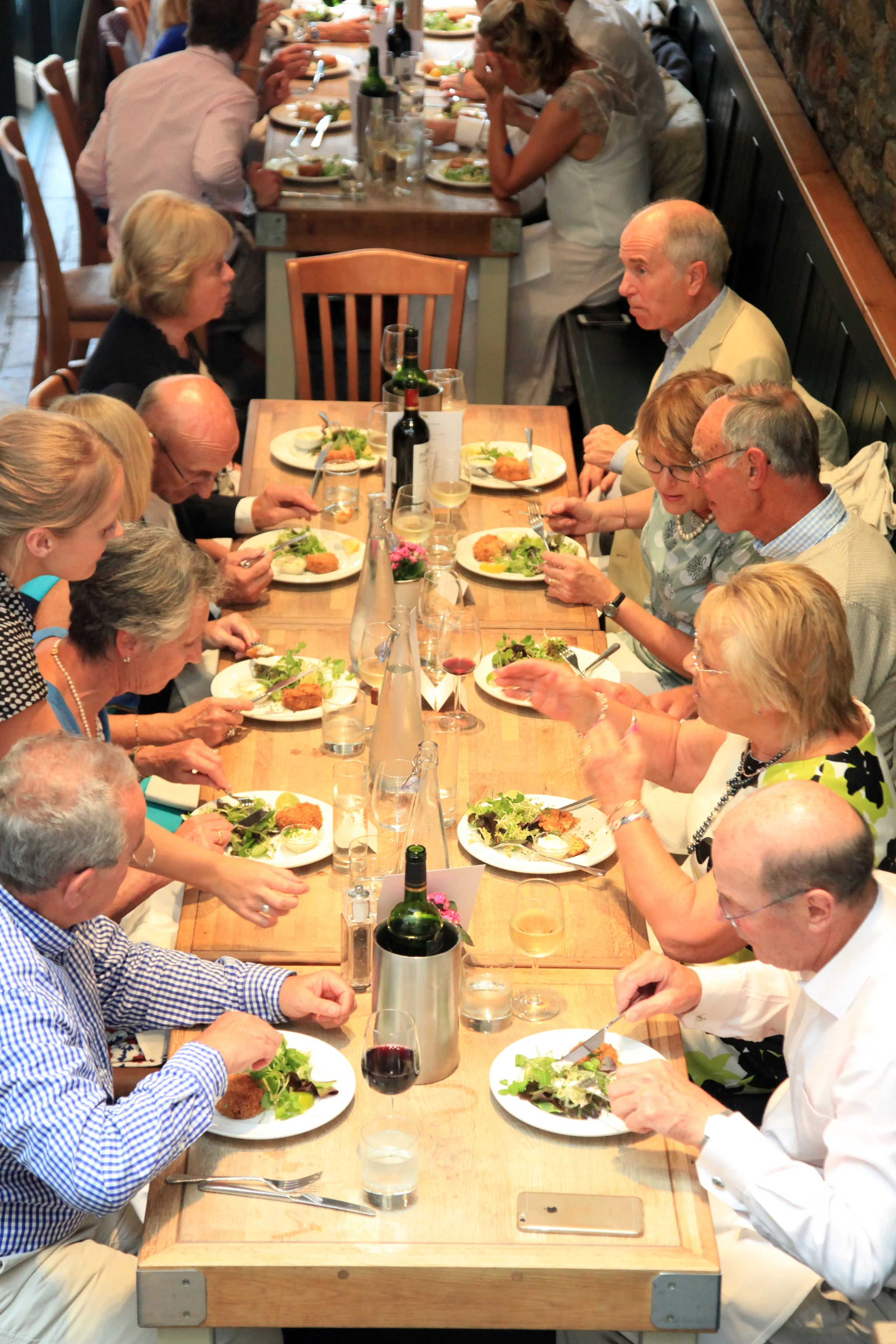
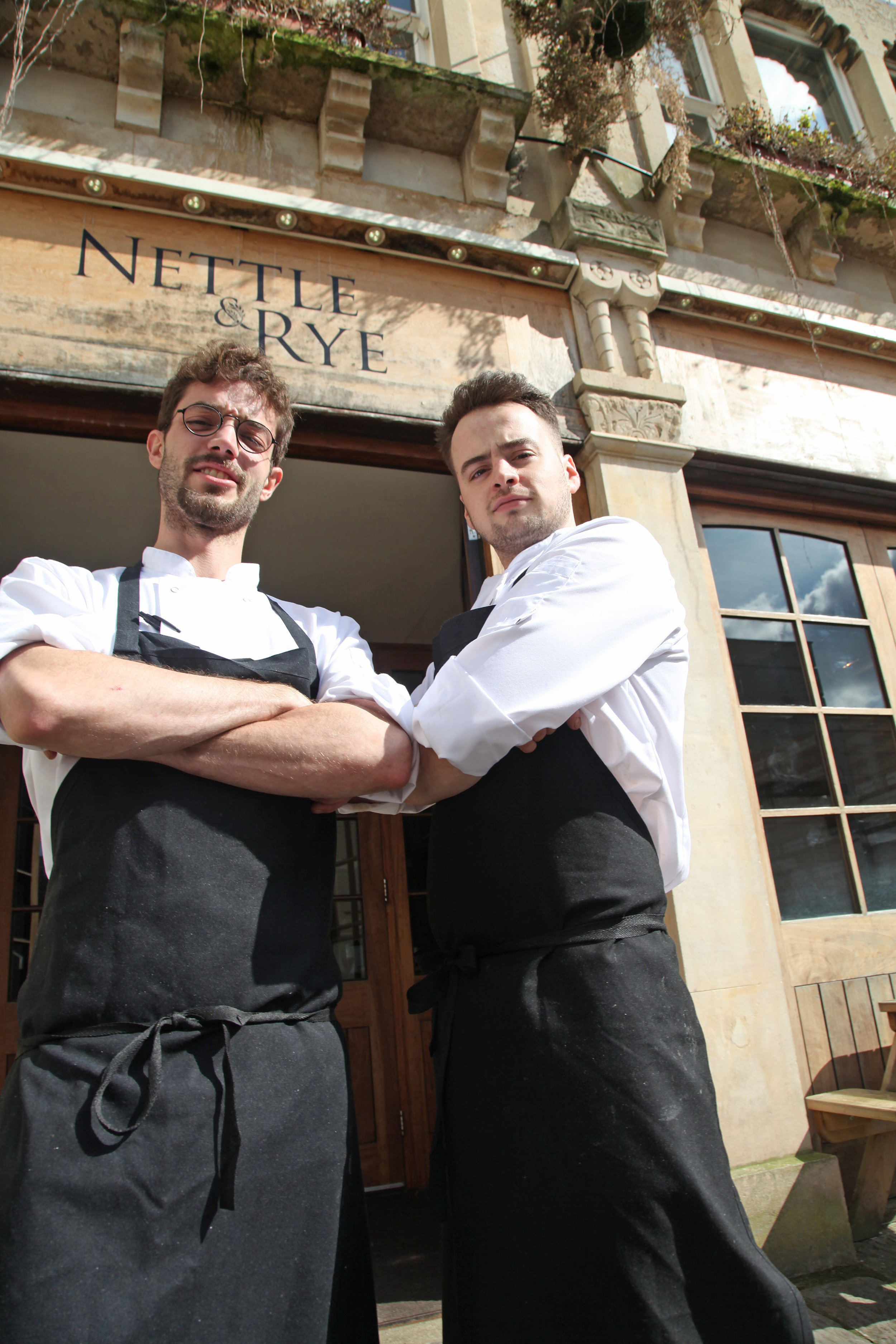
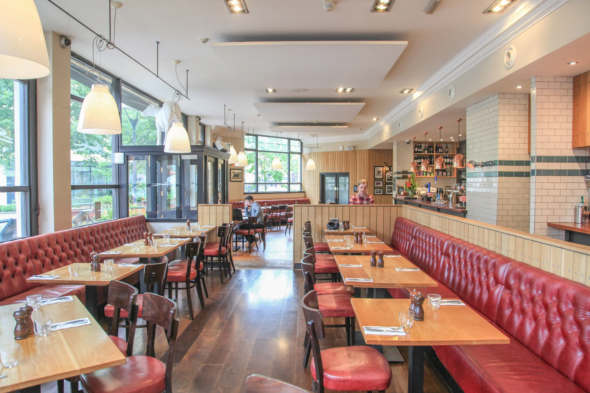
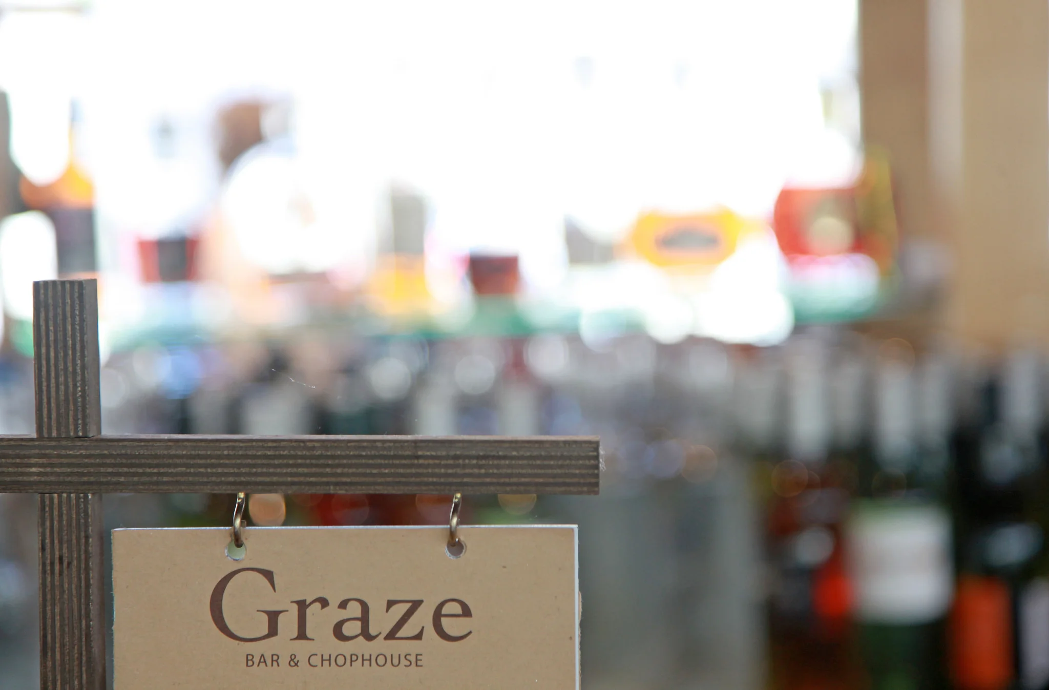
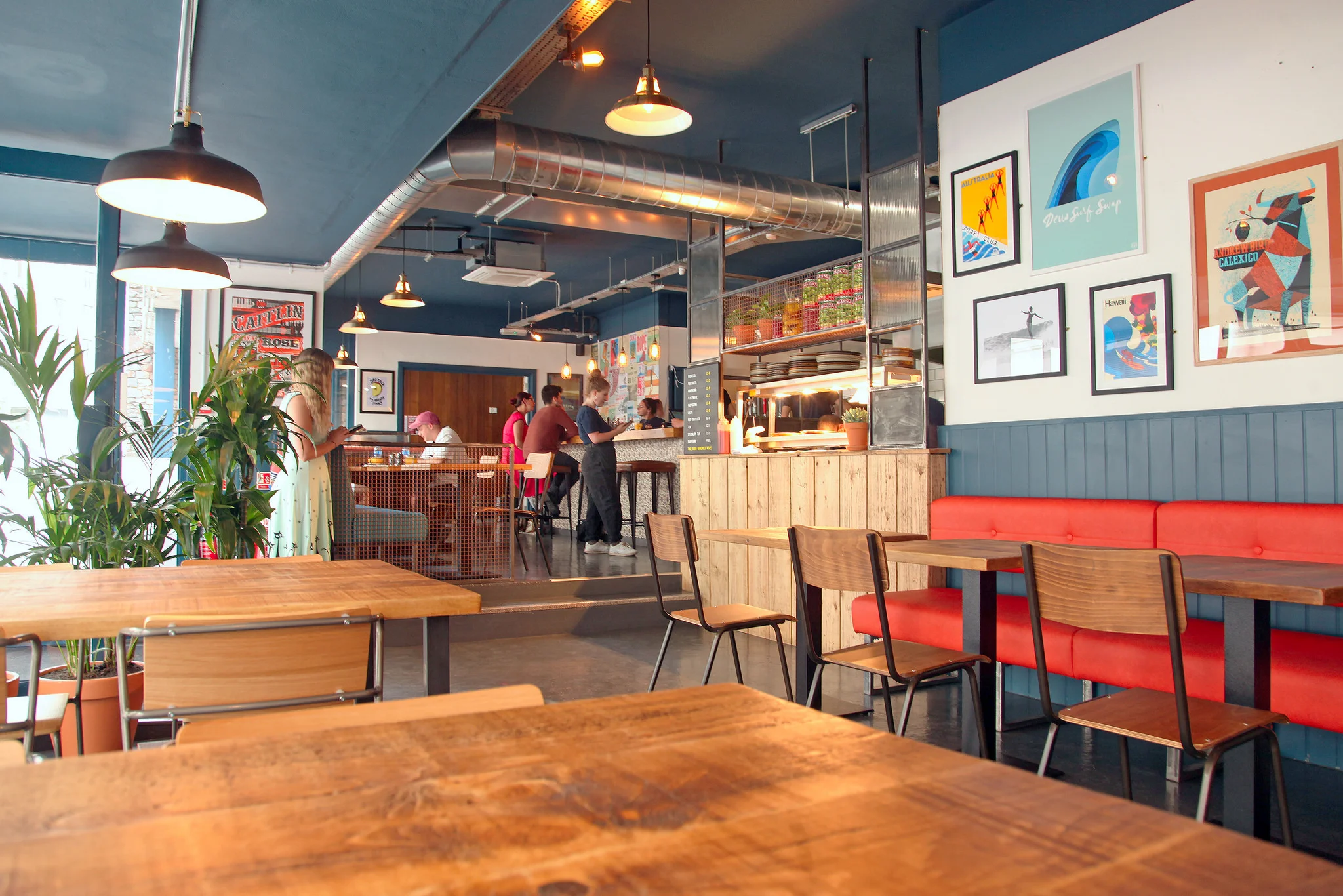
Restaurant, Pub & Event Photography

4
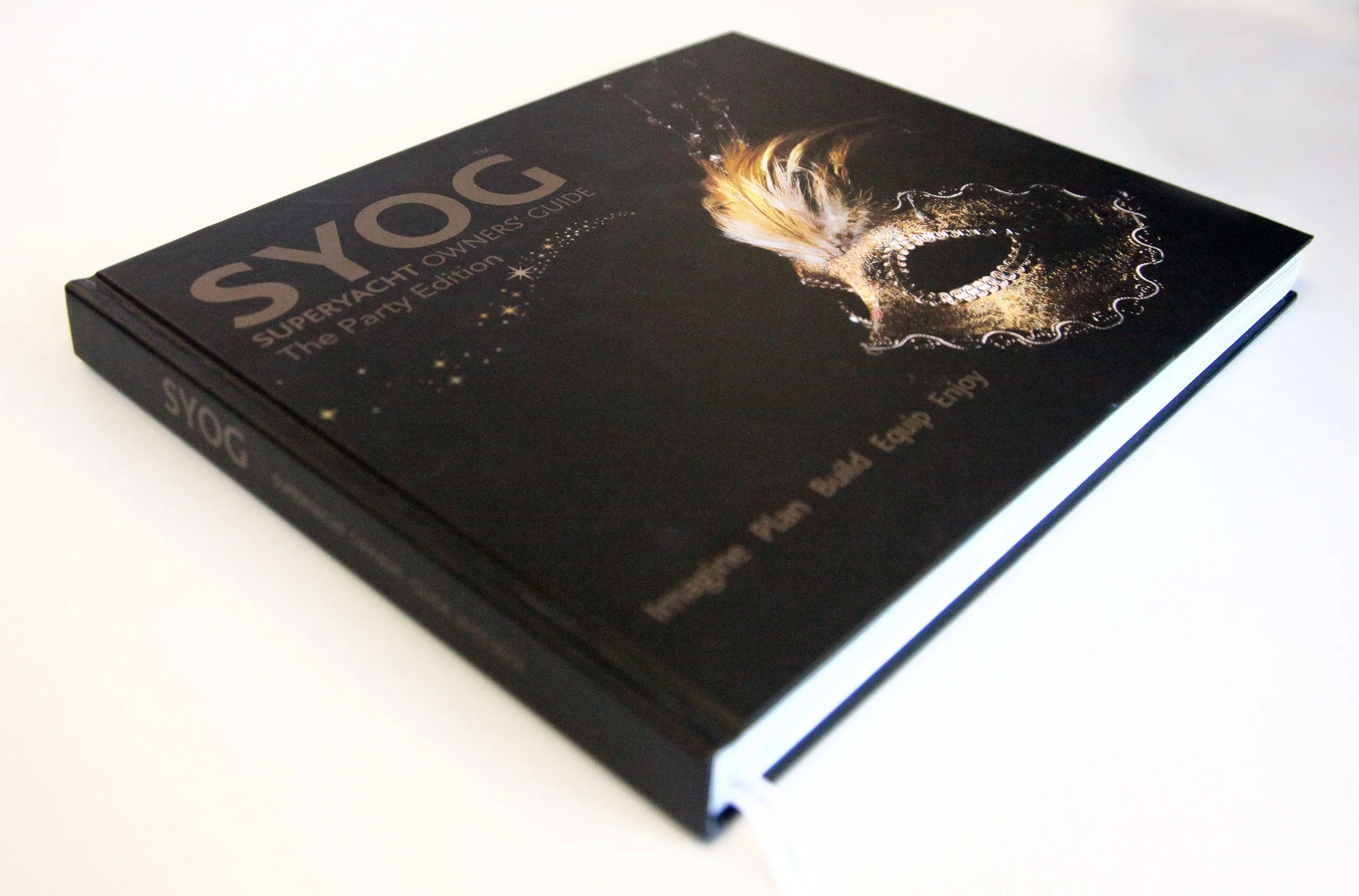
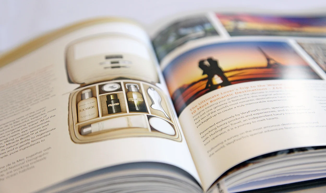
SYOG - Superyacht Owner's Guide Photography